墨尔本咖啡甜点精品巧克力店 Bibelot designed by A Friend Of Mine

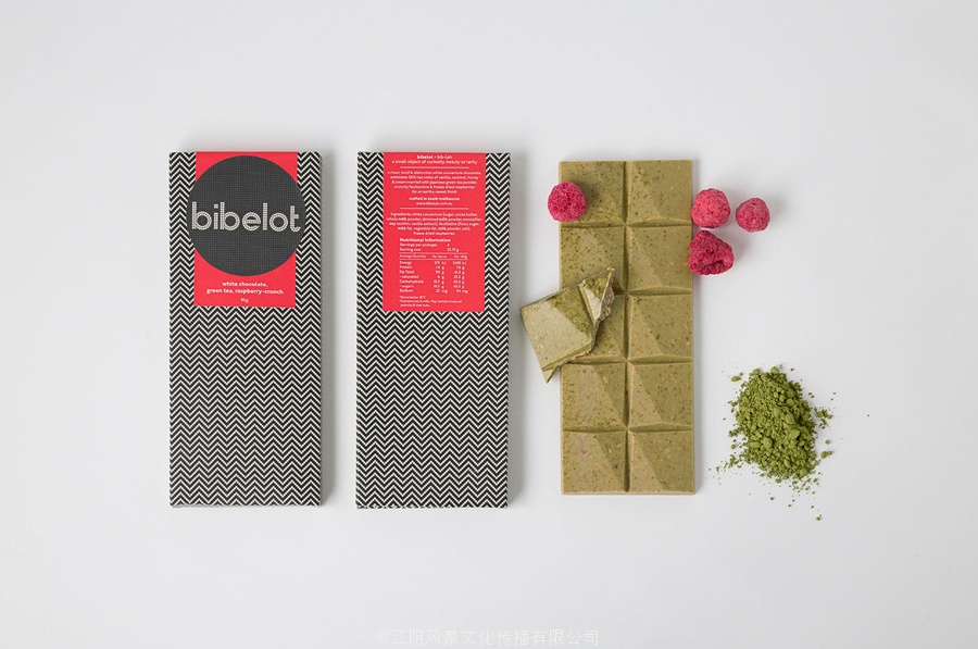
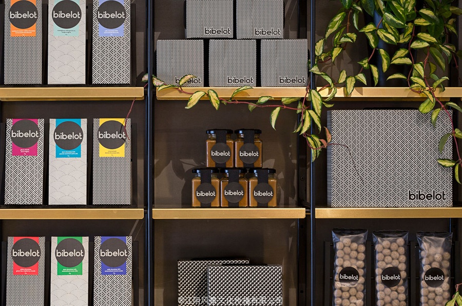
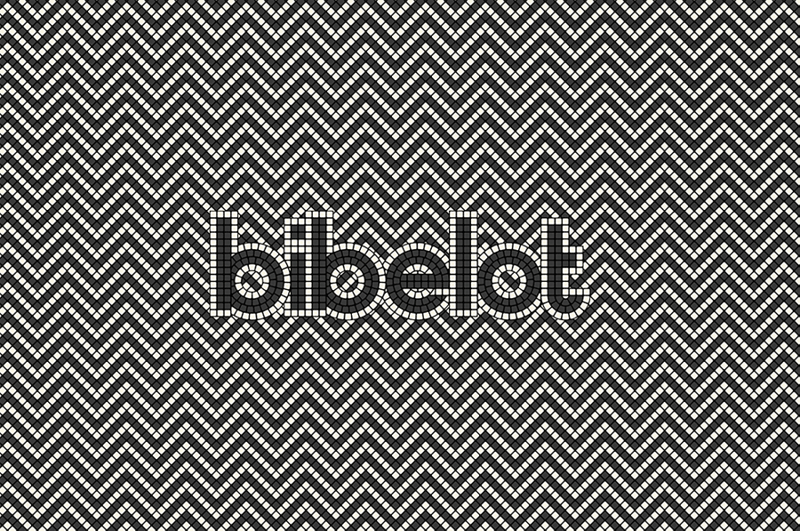
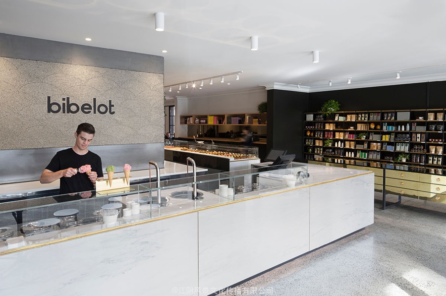
Bibelot is a Melbourne based luxury European-inspired dessert boutique with a coffee bar, chocolate shop, high tea salon, gelaterie and artisinal patisserie. It features an interior of long marble counters, light spotted stone floor, spot lighting, cornicing, black and white walls, and bronze detailing across furniture. Bibelot worked with design studio A Friend Of Mine to develop a brand identity and packaging design treatment, based around black and cream mosaics and a geometric sans-serif logotype, informed by the sense of permanence that underpins its concept and interior design, and draws out the bright detail and craft of its confectionery.
小摆设是墨尔本的一个咖啡吧,豪华欧式风格的甜点精品巧克力店,高茶沙龙,gelaterie和artisinal糕点。它的特点是长的大理石柜台内,光斑点的石头地板,聚光灯,飞檐,黑色和白色的墙壁,和青铜在家具详图。摆设工作设计工作室我的一个朋友发展品牌标识和包装设计处理,围绕黑色和奶油的马赛克和一个几何sans serif字型,通知的永恒感,支撑其概念和室内设计,并绘制出明亮的细节和工艺糖果。
The robust and permanent nature of the materials, black and white panels, classic detailing and elements of geometry across the interior design, juxtaposed alongside the transient, organic and brightly coloured qualities of Bibelot’s confectionery, manifest themselves well throughout A Friend Of Mine’s brand identity and packaging design work.
的鲁棒性和永久性质的材料,黑色和白色面板,经典细节设计元素在室内设计的几何,并列旁边的瞬态,有机和明亮的彩色小摆设的糖果的品质,体现自己在朋友的矿井的品牌标识和包装设计工作。
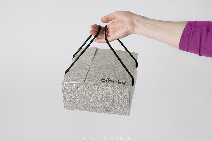
The mosaic panels are a neat idea, linking the digital origins and mobile nature of identity and packaging with physical environment and handmade experience. The traditional qualities of the mosaic aesthetic, its use in floors, its ornate nature, and the hand laid process of its implementation effectively leverage a sense of permanence and make a connection with the skill and art of a confectioner, but can also expand outside of the premises. Although fine in detail, these also deliver impact and distinction from a distance, are well drawn, cohesive and interesting in their variety.
镶嵌面板是一个整洁的想法,连接的数字来源和移动性质的身份和包装与物理环境和手工经验。的传统品质的马赛克审美,其使用在地板,其华丽的性质,和手放过程实施有效杠杆的永恒感,使连接的技巧和艺术的一个糖果,但也可以扩大以外的处所。虽然精细的细节,这些也带来的影响和区别的距离,是很好的绘制,凝聚力和有趣的品种。
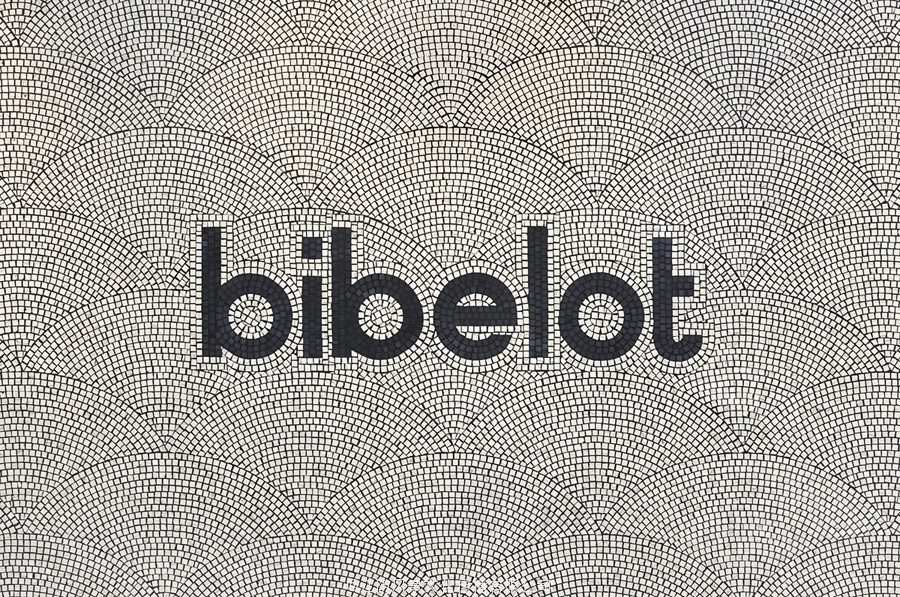

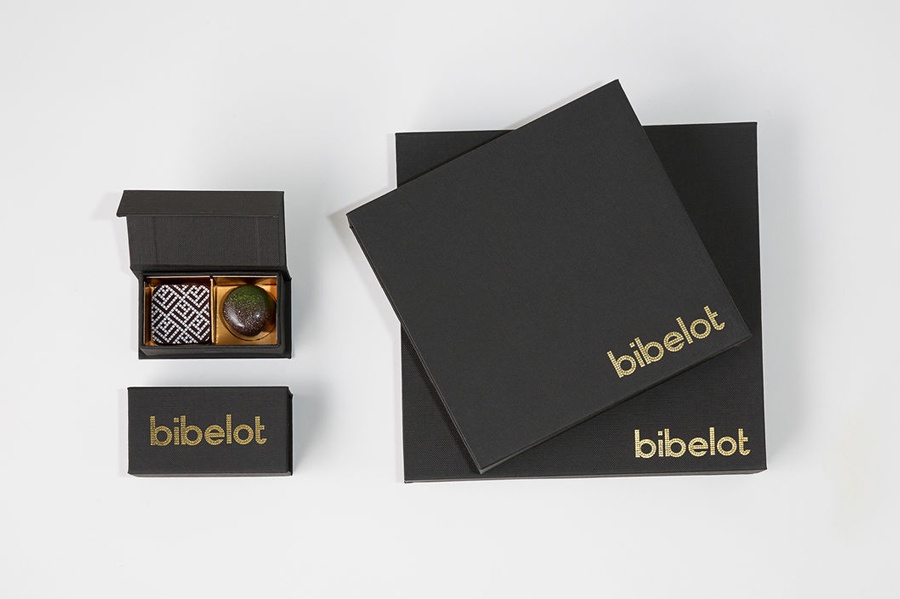
The full bleed, uninterrupted and consistent application of the patterns across a variety of packaging shapes and sizes appears thoroughly contemporary. This modernity drawn out further using a custom geometric sans-serif, and by punctuating a cream and black colour palette with bright spots in print, a simple nod to flavour profile. Weighty black boards and a gold block foil print finish layer this with a familiar but effective sense of quality and luxury.
全出血,不间断的和一致的应用程序的模式在各种包装形状和大小出现彻底的当代。这种现代性的旷日持久的进一步使用自定义几何无衬线字体,并强调奶油和黑色的颜色在打印的亮点,一个简单的点头,香气。沉重的黑色板和一块箔金印完这层熟悉而有效的品质和豪华感。

The contrast between bold characters and small mosaic tiles, monochromatic geometric patterns and organic brightly coloured confectionery, manages to find a comfortable and distinctive intersection of past and present, clearly share a crafted quality, bind identity and interior, and, as described by A Friend Of Mine, avoids pastiche
Design: A Friend Of Mine
Designers: Suzy Tuxen, Cassie Brock and Emily Fitts
Artworking: Mim Kennish
Photography: Sarah Anderson Photography
Opinion: Richard Baird
管理的对比之间粗体字符和小马赛克瓷砖,单色几何图案和有机花花绿绿的糖果,找到一个舒适的和独特的交叉口的过去和现在,显然分享一个精雕细琢的品质,绑定身份和内部,和,如所描述的一个朋友的矿井,避免了仿作
设计:我的一个朋友
设计师:苏西塔克森,凯西Brock和艾米丽
艺术工作:MIM Kennish
摄影:莎拉安德森摄影
意见:贝尔德李察