The Best of BP&O设计公司 — April 2015四月份整理的最佳设计
Curated by Richard Baird.
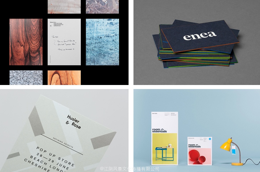
April’s highlights included new packaging for coffee roaster Beanworks by Paul Belford, Bond’s brand identity for Sushi & Co., Spin’s work for contemporary furniture business Simon Pengelly and Maud’s bold brand identity for The National Institute of Dramatic Art. However, there were five projects that stood out and have made it into BP&O’s Best of Series, a feature that brings together the most interesting and unusual projects published on the site each for another opportunity to be seen and shared.
Hustler & Rose designed by Post
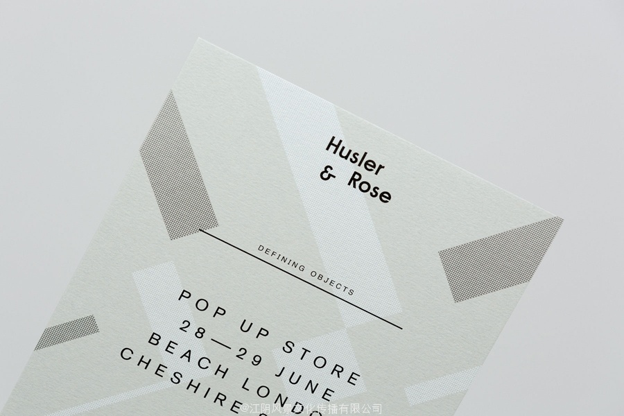
Husler & Rose is an online boutique and occasional pop-up store that retails thoughtfully designed, carefully constructed and long-lasting furniture, homeware and lifestyle objects sourced from across the UK and Europe, professionally and sensitively restored by owner and furniture maker Ben Rowland.
Inspired by Herbert Bayer’s Bauhaus posters and the jazz record sleeves of Duke Ellington, London based design studio Post created a new brand identity treatment for Husler & Rose that included logotype, postcards, business cards and promotional pieces. These capture the crafted and considerately designed nature of the store’s curated catalogue through the high quality finishes of white ink and black block foil, hand stamped detail, geometric patterns and a contrast of serif, script and sans-serif typography, across dyed papers and unbleached boards.
See more of this project here
Finchtail designed by Believe in
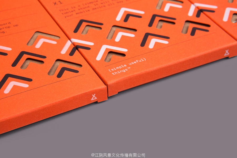
Finchtail is dedicated to the design and manufacture of simple, useful and sustainable solutions to everyday problems. Its first product, a low-cost, flat-packed card tablet and mobile phone stand, features a distinctive brand identity and packaging design treatment developed by Believe in. Monospaced type and corrugated card sit alongside die cut detail, white ink, a bold pattern and a bright dyed board, carefully balancing moments of utility, quality and aesthetic flourish. Alongside visual identity and packaging design, Believe in went on to create point-of-sale, website, marketing materials and a stop-frame video in collaboration with Thank You Mam.
See more of this project here
Room Essentials designed by Collins
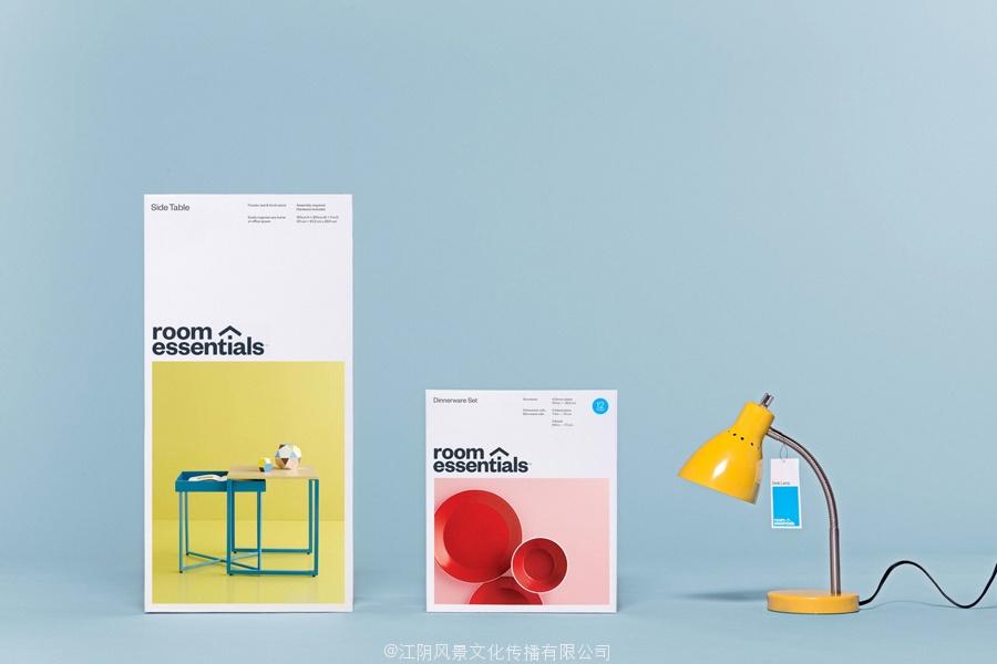
Room Essentials is a line of modernist home furnishings created and sold by American retailer Target. The range covers over 2,000 products across 60 categories, and includes items such as blankets, lighting, chairs, tables and tableware.
While securing significant revenue for the retailer, the range has, over the last five years, experienced a downturn in sales generated by its Millennial demographic. With this in mind, and with the intention of recapturing the enthusiasm for and interest in the range, Target commissioned New York based Collins to reimagine Room Essential’s brand identity.
See more of this project here
Enea designed by Clase bcn
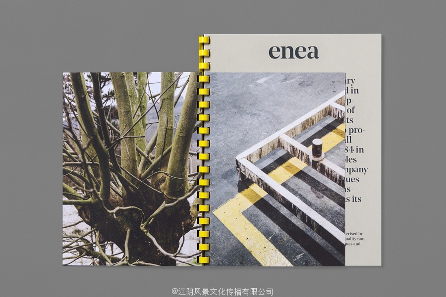
Enea is a contemporary furniture manufacturer with a site in the Basque Country. Collaborating with designers Josep Lluscá, Gabriel Teixidó and the trio Lievore Alhterr Molina, Enea has developed a catalogue of versatile, comfortable, durable and functional products for the private and commercial markets.
Seeking to differentiate itself from its competitors and avoid cliches of the industry, design studio Clase bcn developed a distinctive brand identity treatment for Enea that reflects the company’s Basque origin in a distinctive and contemporary fashion and, using a striking spartan style, references industrial manufacturing. This was visualised through type, colour, image contrast and print, and launched alongside Enea’s latest range which coincided with the Milan Furniture Fair.
Read more of this article here
Markus Form designed by Lundgren Lindqvist
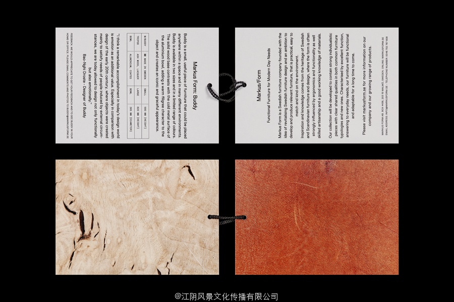
Markus Form is a contemporary furniture company, founded with the intention of revitalising Sweden’s furniture industry, and with an ambition to produce relevant, practical and easy to match designs that are durable and sustainable. The company’s furniture will also draw on a significant Swedish and Scandinavian design culture and heritage that unites ergonomics, functionality, craftsmanship and a good working knowledge of materials, whilst also being individualistic. Markus Form describe their philosophy as one that takes on greater challenges than those posed by form and finish, and acknowledges furniture as an architectonic component that has to handle scale and other spatial conditions and addresses everyday needs.
These values are the basis of Markus Form’s brand identity, developed by Lundgren Lindqvist, and expressed using reductive, geometric, typographic shape and its consistent application, an appropriate use of space, proportion and layout, detail and the absence of detail, print finish and the distinctive and contextual qualities of unusual product photography.
See more of this project here
策划人李察贝尔德。
四月的集锦包括由外相保罗咖啡烘焙beanworks新包装,寿司公司债券的品牌标识,为国家机构省DRA马蒂奇艺术当代家具生意的西蒙和莫德的大胆彭杰利品牌识别旋转的工作。然而,有五个项目中脱颖而出,已经进入了BP和O最好的系列,一个功能,汇集了发表在网站上的每个机会被看到和分享最有趣的和不寻常的项目。
骗子和玫瑰由后
用于标识和黑块Heusler铝箔印刷设计后的玫瑰
Heusler和玫瑰是一个在线的精品和偶尔的弹出式商店,零售的精心设计,精心构建和持久的家具,家居用品和生活方式的对象来自英国各地和欧洲的,专业的和由业主和家具制造商Ben罗兰灵敏恢复。
灵感来自赫伯特的包豪斯的海报和艾灵顿公爵的爵士乐唱片套,总部位于伦敦的设计工作室后创建的Heusler和新的品牌形象处理的玫瑰,包括标识,明信片,名片和宣传片。这些捕获的制作和体贴的设计性质的商店的策划目录通过白色油墨和黑色块箔的高质量完成,手上的细节,几何图案和字体对比,脚本和无衬线的字体,在染色纸和本色板。
看到更多这样的项目在这里
finchtail由相信
视觉形象和包装设计相信在finchtail手机和平板站
finchtail致力于制造设计简单,有用的和可持续的日常问题的解决方案。它的低成本的产品,第一,平板包装卡平板和手机站,特色鲜明的品牌标识和包装设计处理的信。等宽型和波纹卡坐在模切细节,白墨,大胆的图案和明亮的染色板,仔细平衡的时刻,实用,质量和审美发展。除了视觉形象和包装设计,相信在继续创造销售点,网站,营销材料和停止帧视频合作谢谢妈妈。
看到更多这样的项目在这里
房间要点由柯林斯
标识,为目标的现代家居空间要素的范围柯林斯摄影和包装
房间的本质是现代家居装饰线和创造美国零售商Target销售。范围涵盖超过2000的产品在60个类别,包括物品,如毛毯,灯光,椅子,桌子和餐具。
同时确保零售商显著收入,范围,在过去的五年中,经历了千年的人口所产生的销售下滑。有了这个想法,并与回顾的热情和兴趣的范围的意图,目标委托纽约的柯林斯构想室必备的品牌标识。
看到更多这样的项目在这里
Enea的BCN设计类
家具设计与制造业务的条款设计目录机构BCN
Enea的是一个在巴斯克当代家具制造商的网站。与设计师Josep lluscá合作,加布里埃尔teixidó和三列若alhterr莫丽娜,Enea公司开发的一种多功能,舒适的目录,为私人和商业市场的耐用和功能性产品。
为了区别于其竞争对手,避免行业的陈词滥调,设计工作室该BCN开发Enea的反映在一个独特的和当代的时尚和公司的巴斯克起源鲜明的品牌标识处理,使用一个引人注目的斯巴达风格,借鉴工业


