


新加坡珀蒂有机餐厅Podi designed by Bravo Company布拉沃设计
![]()
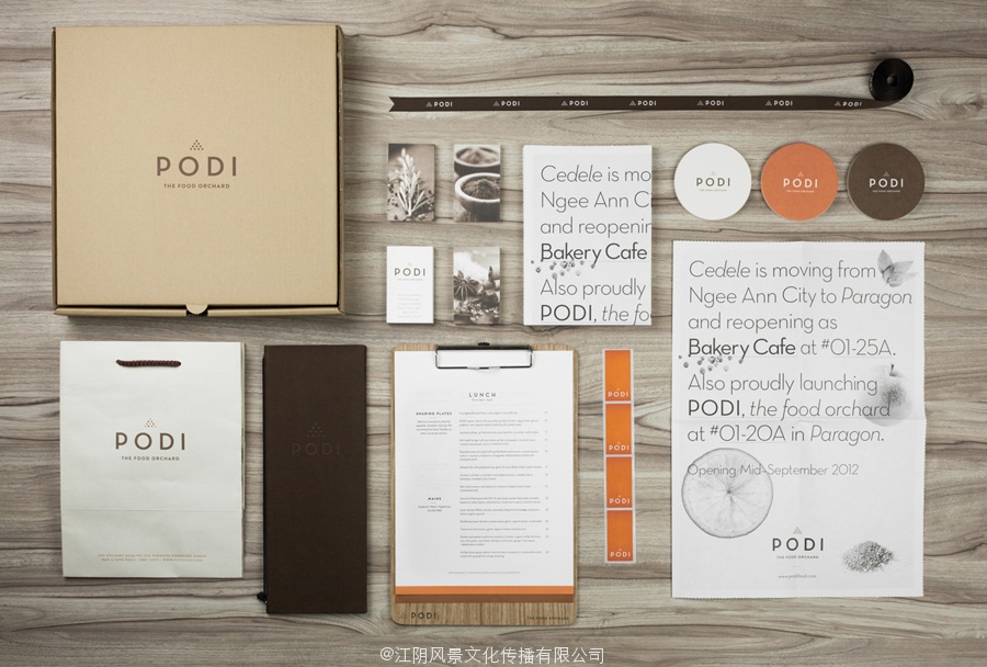
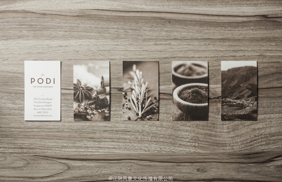
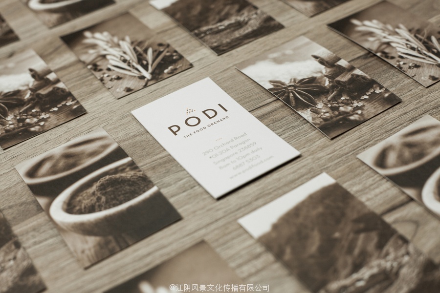
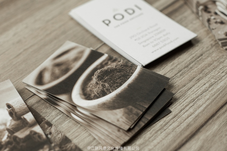
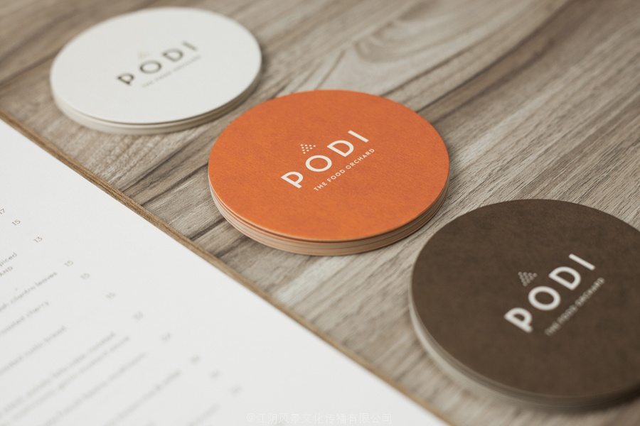
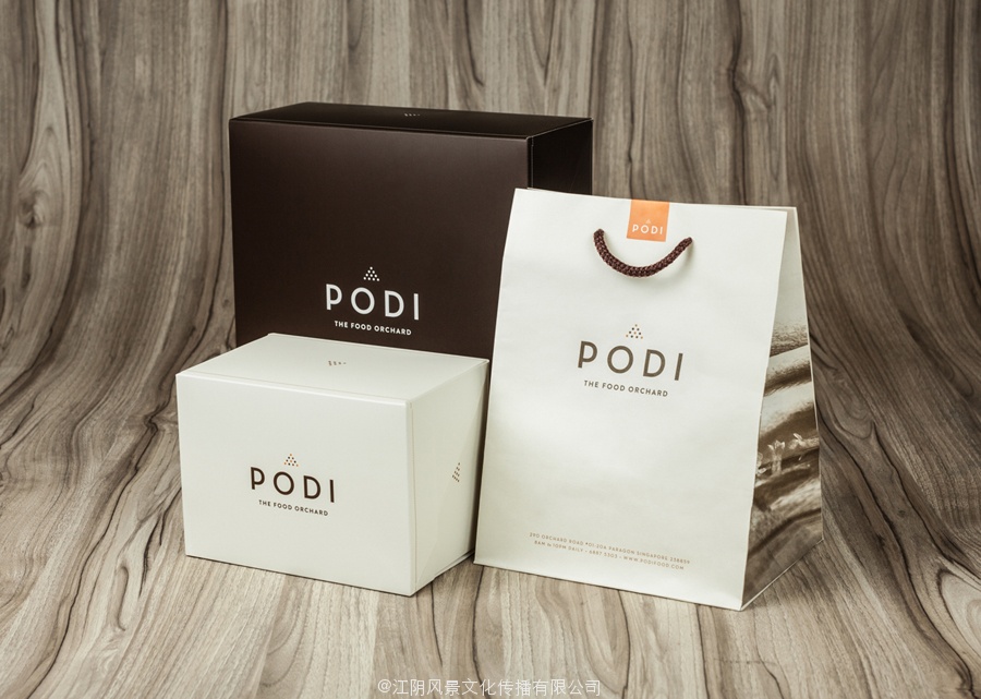
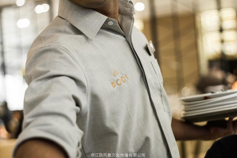
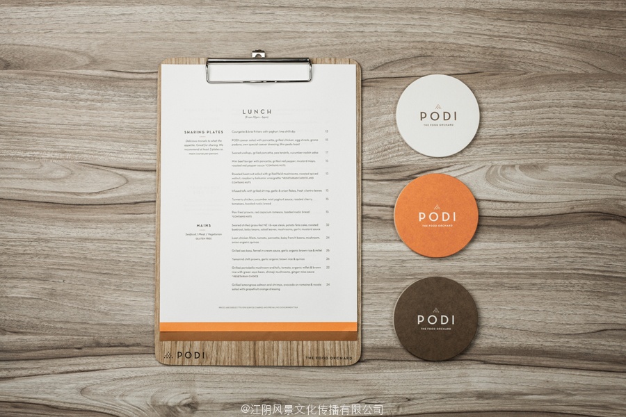
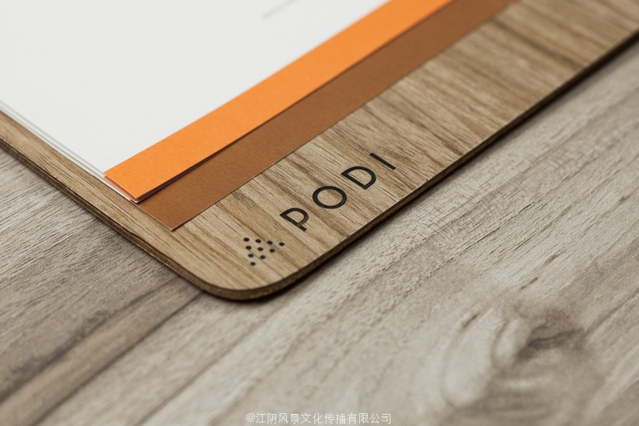
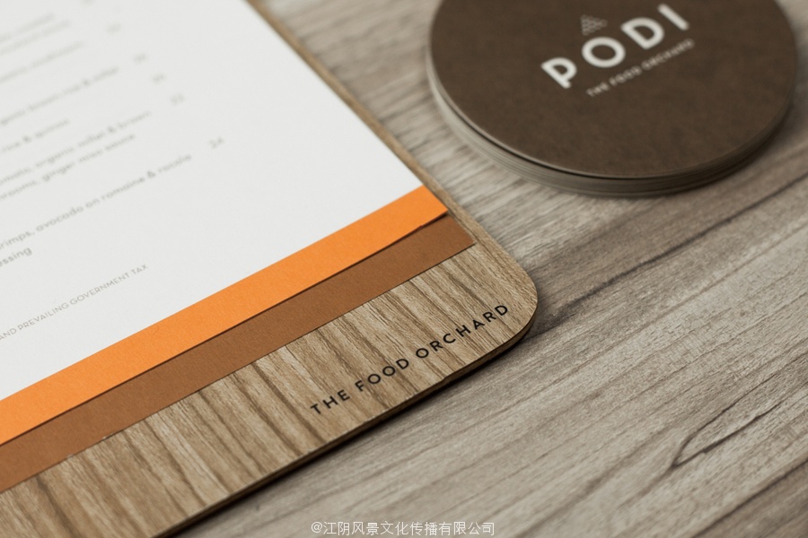
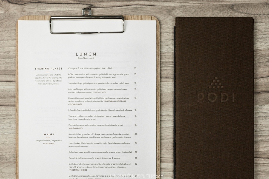
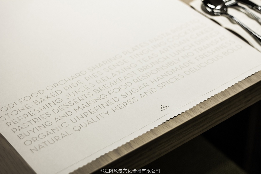
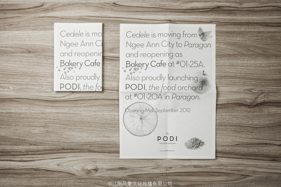
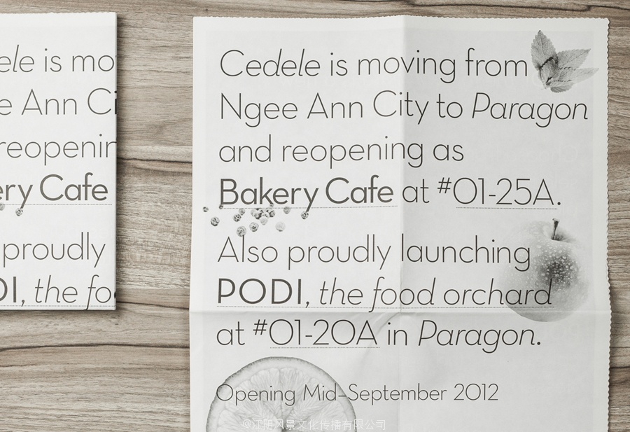
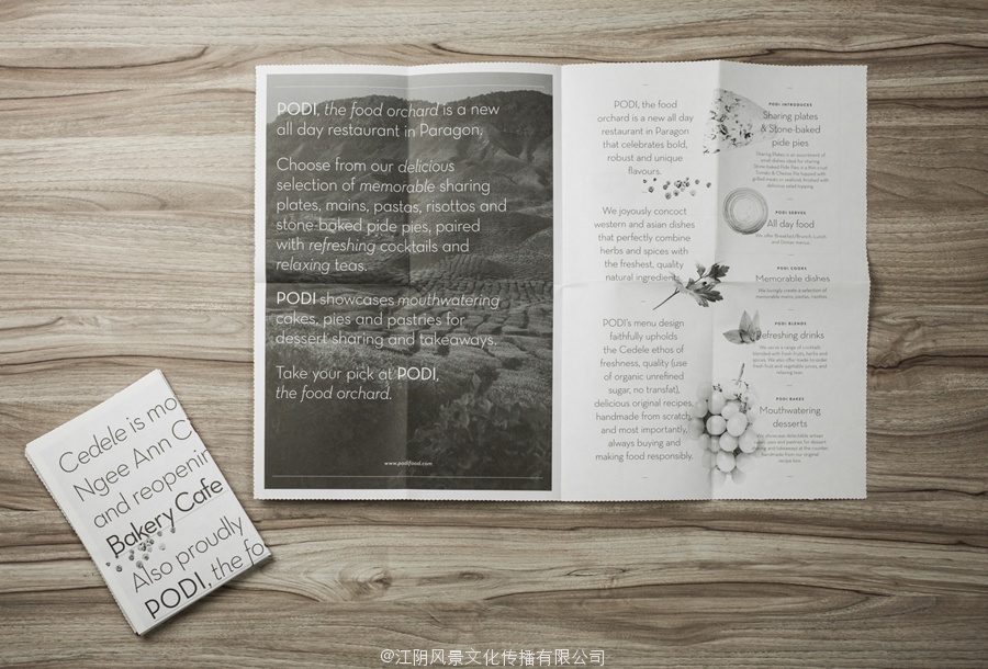
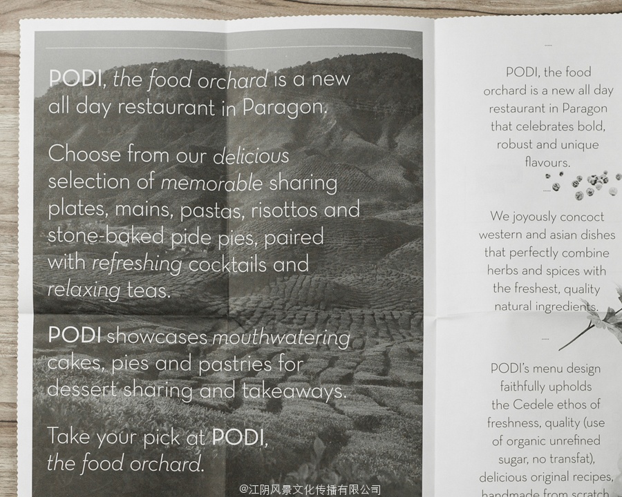
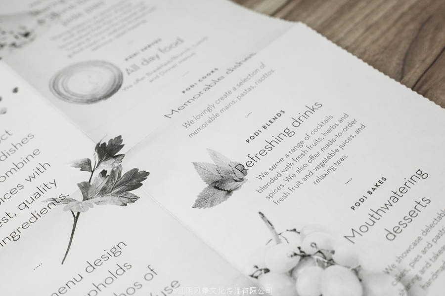
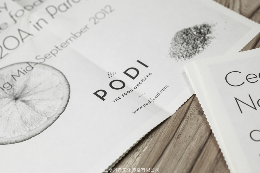
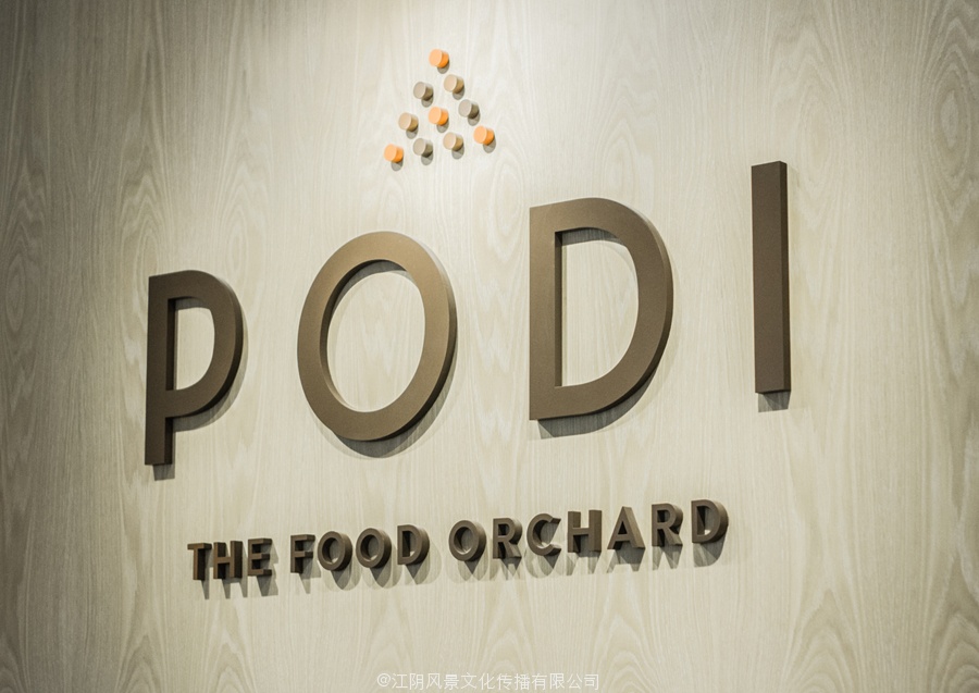
Podi is a Singapore-based organic restaurant that ‘celebrates bold, robust and unique flavours’ and the responsible sourcing and cooking of ingredients. Drawing inspiration from the restaurant’s name, a Hindi word to describe a mixture of ground dry spices and herbs, design agency Bravo Company developed a visual identity that pairs a small, abstract interpretation of heaped spices with a bold logo-type, earthy tones and tinted imagery to reflect Podi’s mission of making ‘good, natural and organic food’.
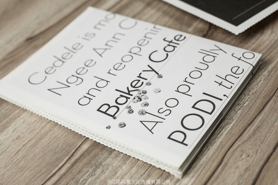
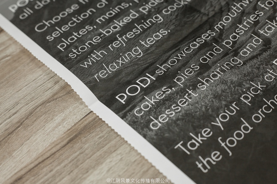
The simplicity of an uppercase logo-type built from an on-trend combination of single stroke width geometric sans-serif characters, laid out with plenty of line and character space, and the finer detail of the logo-mark above – a contrast that perhaps reflects bold flavour achieved through careful spicing – are juxtaposed alongside the richer detail of full bleed photography. These intelligently balance the theme of elemental base ingredients and a ‘from scratch’ philosophy, also reflected by the isolated fruits, herbs and spices of the marketing materials, with landscapes that depict their natural untouched provenance. These introduce a nice aesthetic and communicative depth to the straightforward professionalism, consistency and quality conveyed by the logo-type and a type-based print direction.
The photography, identity and typography are neatly bound by the economical but contemporary sensibilities of a limited colour palette of soil brown and spicy orange set across an uncoated kitchen white, and the material choices of wood, fabric and unbleached boxes that add an earthy and tactile experience.
![]()
Follow BP&O:
RSS
Facebook
Twitter
无衬线字型的布拉沃公司为新加坡设计了基于有机餐厅珀蒂
珀蒂是新加坡一家有机餐厅,庆祝大胆,强大和独特的风味和负责采购和烹饪配料。从餐厅的名字中汲取灵感,印度语词来描述混合地面干香料和药草,设计机构布拉沃公司开发的视觉识别,对一个小堆,香料和大胆的标志类型的抽象解释,朴实的色调和色彩意象反映了珀蒂的使命,使“好,天然和有机食品。
建立了从一个单笔画宽度几何无衬线字趋势结合大写标志类型简单,奠定了与线和字符空间充足,和更精细的细节的标识标记以上–对比,反映的是大胆的味道通过精心调味–取得并列在全排摄影更丰富的细节。这些智能平衡元素的基本成分和“从无到有”哲学的主题,由孤立的水果也反映,草药和香料的营销材料,以描写自然景观没有出处。这些介绍一个好的审美和交往深度的简单的专业性,一致性和质量的标志类型和类型的打印方向输送。
摄影,身份和字体是由经济但当代有限的土褐色和辛辣的橙色在未涂覆的厨房白色调色板的情感束缚得整整齐齐,和木材的材料的选择,织物和未漂盒加一个土和触觉的体验。
标志设计的布拉沃公司新加坡的有机餐厅珀蒂