


赫尔辛基的健康食品店PÜR designed by Bond
Finnish design agency Bond have published their brand identity work for health store PÜR—which included logo and interior design, website, photography, advertising and marketing collaterals.
Bond’s approach, a blend of bold sans-serif typography that leverages a playful typographical quirk, earthy material detail, iconography, a pastel colour palette and still life photography, delivers a strong communicative resolution of reliability, nature, accessibility and effectiveness, delivered in an engaging and multi-dimensional way.
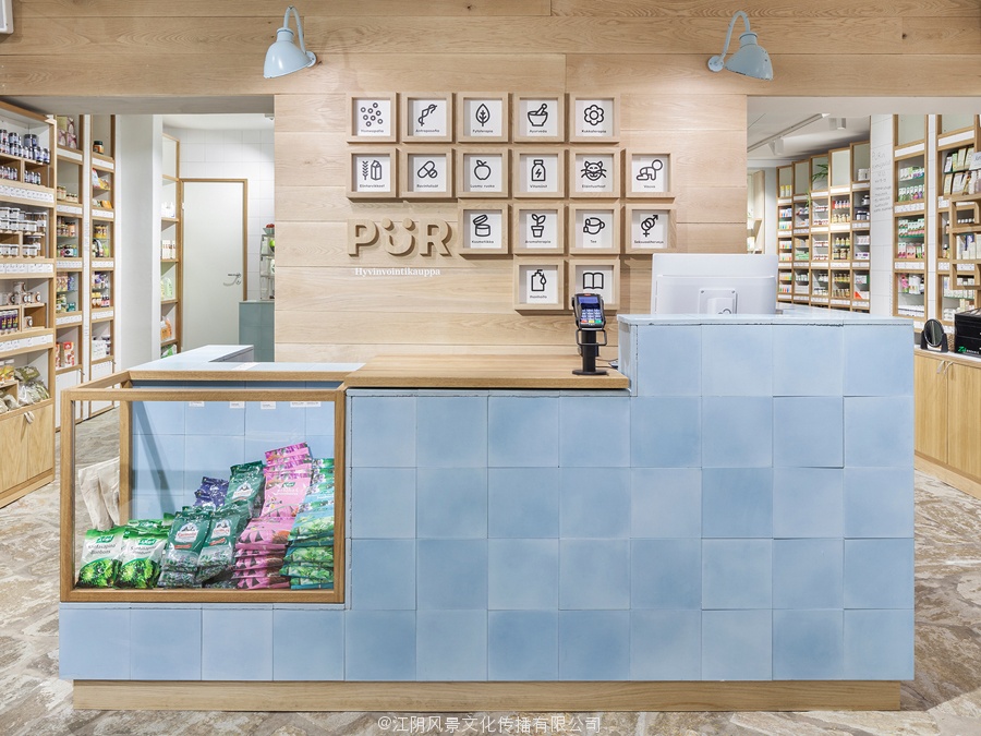
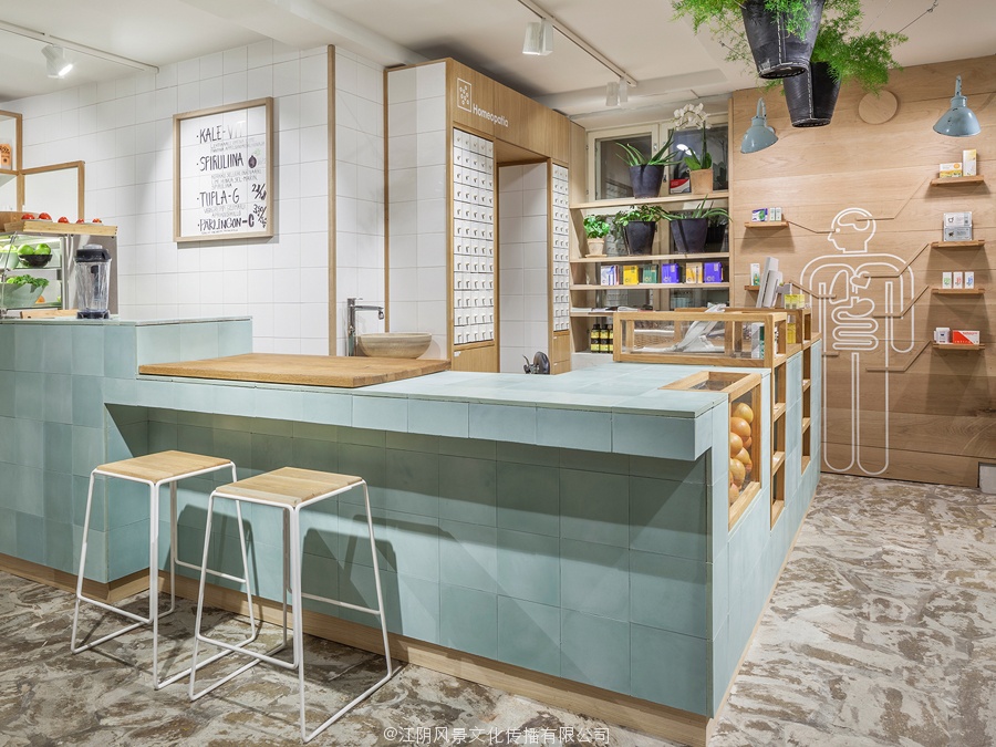
Like any good brand identity project Bond has clearly allowed the most communicative aspect of a brand experience, in this case interior, to lead. Its mix of white tiles, white powder-coated stools and traditional pharmacy shelves alongside light woods, green plants and loose cut stone, achieves a careful synthesises of whole-food and pharmaceutical cues in order to convey a natural effectiveness in a familiar yet distinctive way.
![]()
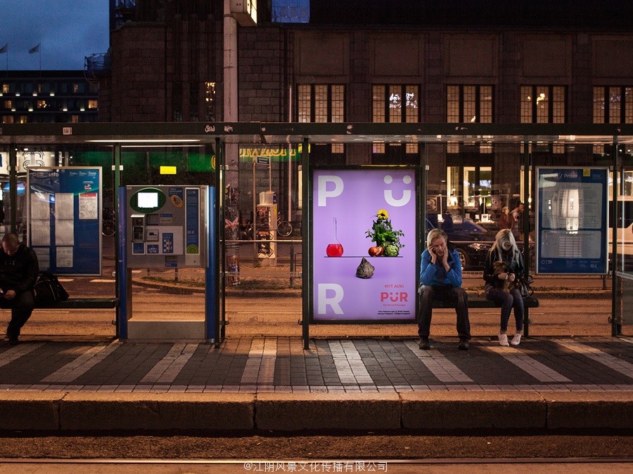
The graphical components reinforce the environmental experience, and are utilised effectively to convey similar values outside of the physical premises in print.
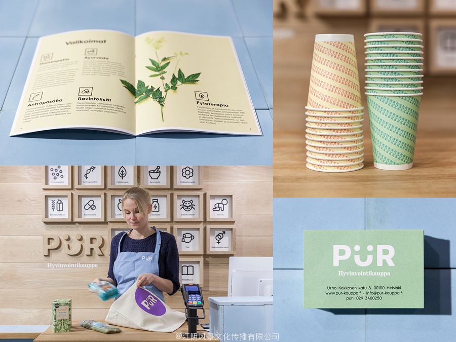
The logotype’s uppercase sans-serif letterforms are bold and robust, reliable and practical but appropriately tempered by the playful detail of the Ü, a common typographical observation and quirk, often perceived as a smiling face, that gives it a friendly and universal sense of accessibility. This accessibility also runs through a soft pastel colour palette and the curves of contemporary single line weight iconography. The use of a traditional serif byline is a quick reminder of the pharmaceutical effectiveness and informed advice visitors can expect to receive.
![]()
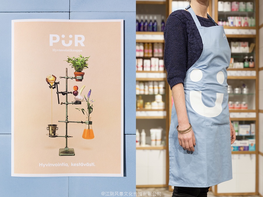
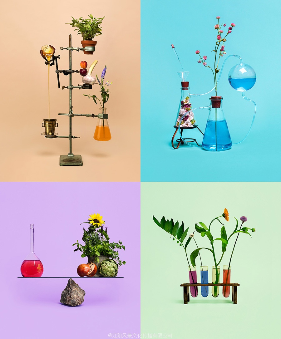
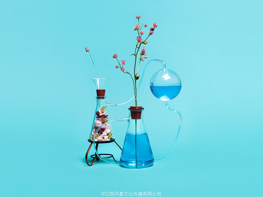
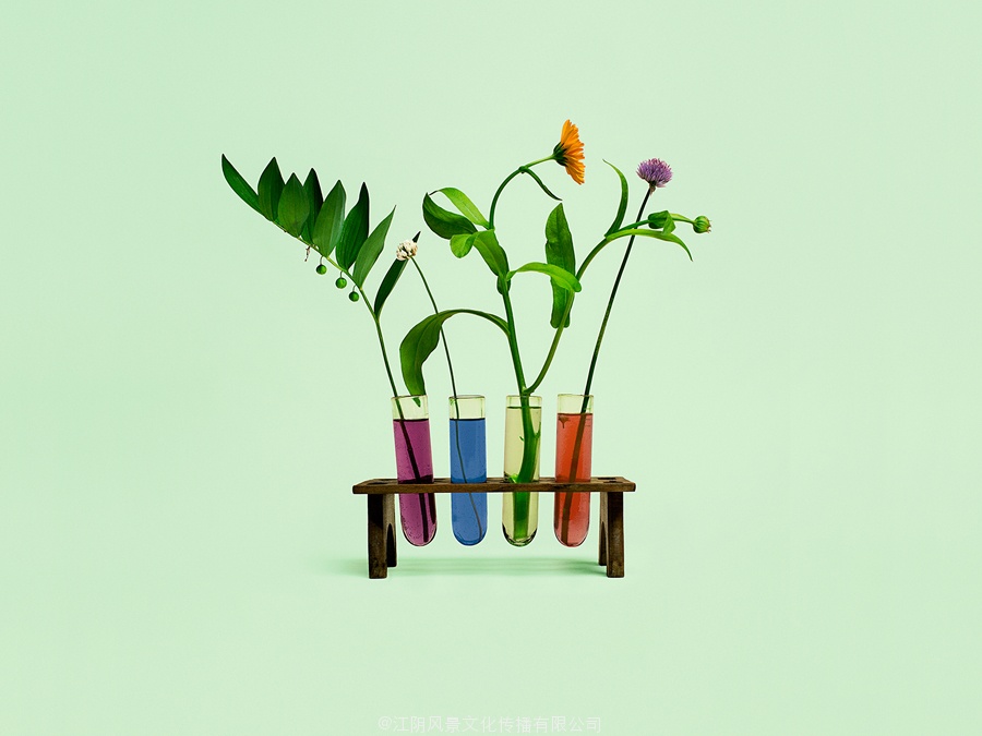
The photography manages to distill the duality of the environment, an effective union of science, nature and accessibility, into a creative and well shot set of still life images able to exist in print and online. It is an approach, recently leveraged by Studio Round for restaurant Brae and Naughtyfish for property developer 41 Birmingham both in concept and execution, that effectively leverages the perceived disparity of two ideas and their associated aesthetics to deliver both communicative and visual impact.
Follow BP&O:
RSS
Facebook
Twitter
The project is an effective and communicative piece of brand identity work because it utilises the familiar and gives these a distinction through their cohesive distribution across multiple mediums.
标识,印刷,摄影和内部债券赫尔辛基的健康店ÜR P
芬兰设计机构债券已经发表了他们的品牌标识工作健康店Ür-which包括标识和室内设计,网站,摄影,广告和营销抵押品。
债券的方法,融合了大胆的无衬线的字体,利用一个有趣的版式怪癖,朴实的材料明细,影像学,柔和的色彩和静物摄影,提供了一个强大的交际解决可靠性,自然,可访问性和有效性,在参与和多维的方式交付。
由芬兰健康店ÜR键的室内设计
像任何好的品牌标识项目债券已明确允许一个品牌体验最交际方面,在这种情况下室内,导致。它的白色的瓷砖,白色粉末涂层的凳子和传统药房货架与光的树林,绿色的植物和松散的石头切割,达到仔细综合整个食品和药品的线索,为了在一个熟悉而独特的方式传达了一种自然的效果。
由芬兰健康店ÜR键的室内设计
由芬兰健康店ÜR键的肖像
图形元件加强环境体验,并利用有效的传达类似的值的物理场所外,在打印。
标识的无衬线字体大写是大胆而稳健,可靠实用但适当锻炼的Ü俏皮的细节,一个普通的印刷的观察和怪癖,经常被看作是一张微笑的脸,给它一个友好的和可访问性普遍意义。这个访问也贯穿着一个柔和的调色板和当代肖像单线重量曲线。一个传统的衬线函数使用快速提醒的医药效果和信息咨询的游客可以期望获得的。
标志设计以赫尔辛基为基础的健康商店,P键ÜR
标志,打印,由芬兰健康店ÜR键摄影和室内
摄影管理提取环境的两重性,科学性和可达性,有效结合,为创意和拍摄静物图像能够在印刷和在线的存在。它是一种方法,最近利用工作室轮为房地产开发商41伯明翰在理念和执行餐厅的斜坡和naughtyfish,有效利用感知差距两思想及其相关的美学提供交际和视觉冲击。
静物摄影的芬兰健康店ÜR键
静物摄影的芬兰健康店ÜR键