


Sushi寿司 & Co. designed by Bond
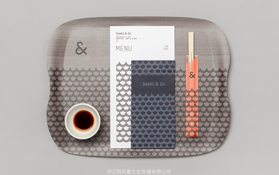
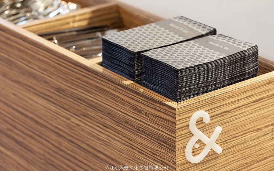
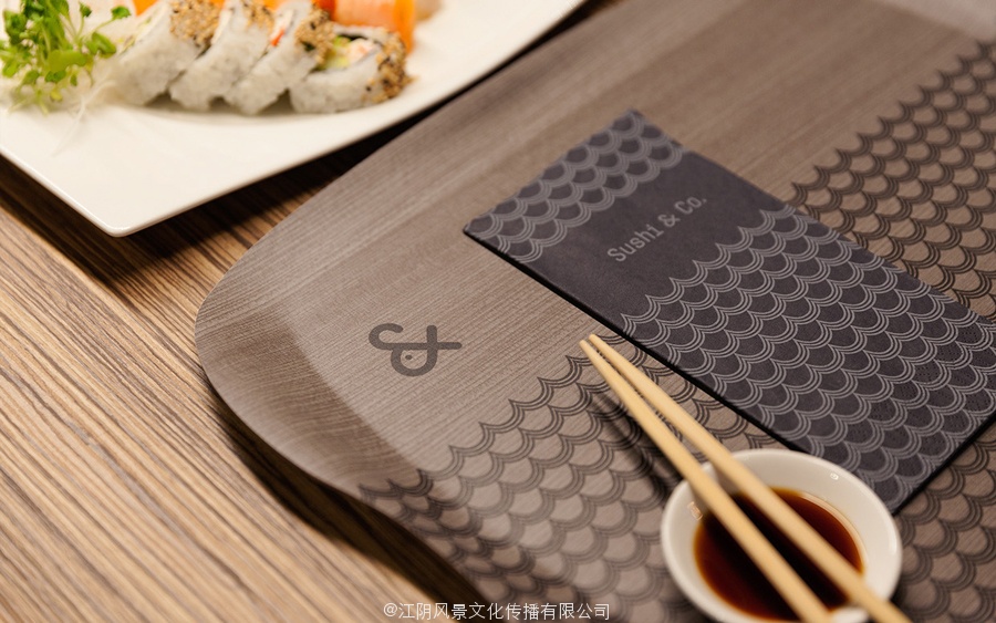
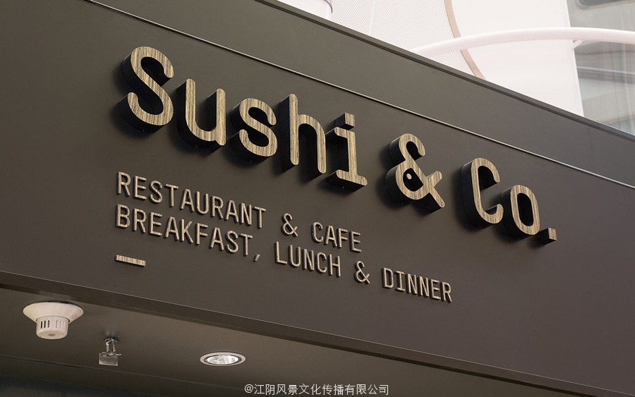
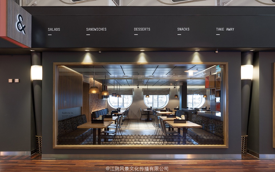
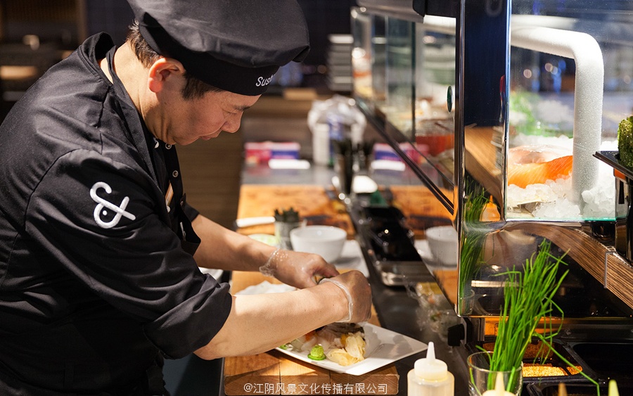
Sushi & Co. is a restaurant and cafe onboard a cruise ship taking guests to destinations along the Baltic Sea. It has a modern interior design of dark and light wood furniture and fittings, warm low hanging lighting, organic patterned upholstery, cool grey walls, exposed brick panels, slate floors and a visual identity developed by Helsinki based studio Bond. Extending across menus, napkins, uniforms and signage, Bond’s visual identity leverages association, familiarity and the unexpected, through colour, form and type, to introduce a current Scandinavian simplicity to rich interior detail.
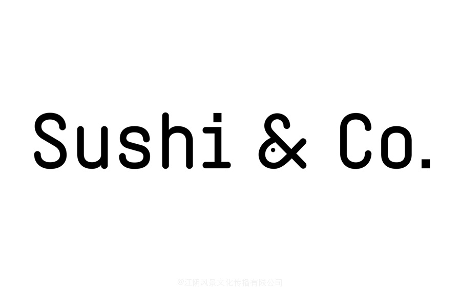
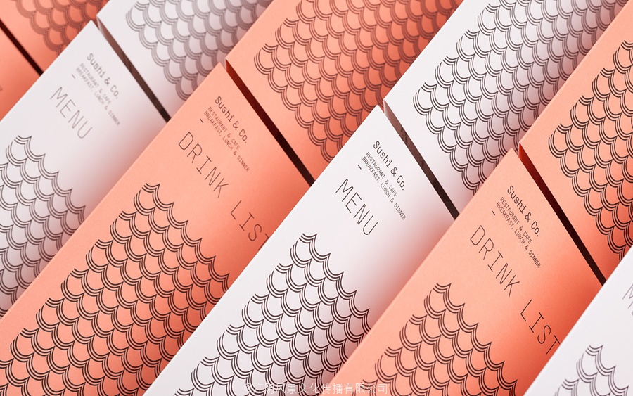
Where the wave and scale-like pattern, salmon red colour and fish iconography embraces familiarity and association within the context of a seafood restaurant, all the more relevant because of the restaurant’s cruise ship location, the monolinear, monospaced and condensed qualities of the logotype, punctuated by a moment of play within the ampersand, is unusual and unexpected.
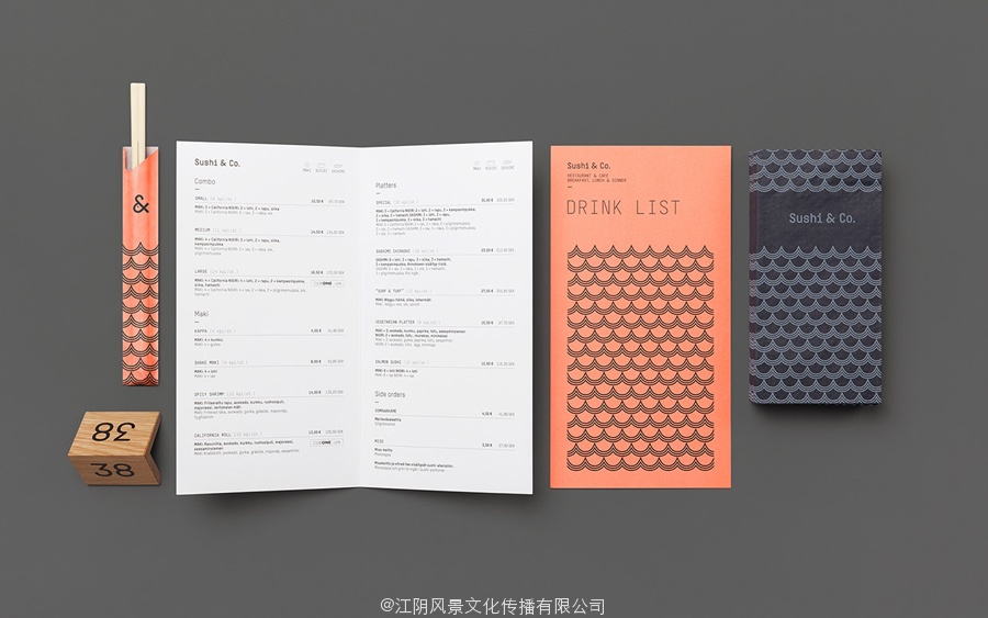
Although mechanical and impersonal across the menus, type is well integrated into environment through wood and illuminated signage. Much like the fish within the ampersand, the use of a wood grain across the surface of monospaced type is distinctive in its contrast of ornamental flourish and typographical utility. This contrast continues through to a white paper and black ink economy alongside panels of a Pantone red that interrupts a dark interior with a moment of colour, in the same way the geometric wave pattern breaks from organic material texture.
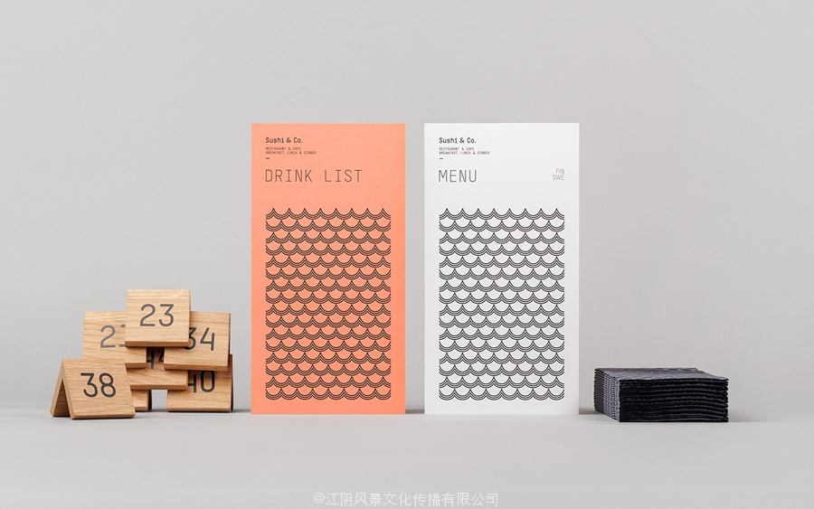
The result delivers moments of cohesion and contrast, utilises the expected and the unexpected, and draws play from utility with very few assets, an appreciation for space and reduction, interior detail and the restaurant’s Scandinavian location.
Design: Bond
Photography: Angel Gil
Opinion: Richard Baird
Fonts Used: T-Star Mono Round
Follow BP&O:
Feedly
Facebook
Twitter

视觉形象和菜单为波罗的海邮轮餐厅寿司公司由债券
寿司公司是一个咖啡馆和餐厅邮轮上以客人的目的地沿波罗的海。它有一个现代的深色和浅色的木质家具和配件的室内设计,温暖的低挂的照明,有机图案装饰,冷灰色的墙壁,裸露的砖板,石板地面,由赫尔辛基开发可视化的基于身份的工作室债券。穿过菜单,餐巾,制服和标志,债券的视觉形象,利用协会,熟悉和意外,通过色彩,形式和类型,介绍当前的斯堪的纳维亚简单到丰富的内部细节。
等宽字体标识为波罗的海的游轮餐厅寿司公司由债券
在波和鳞片状图案,鲑鱼红色鱼意象包括熟悉和协会内的一家海鲜餐厅的背景下,所有有关的因为餐厅的游轮的位置,线性,等宽和标识浓缩的特质,并以一刻在符号,是不寻常的,意外的。
视觉形象和菜单为波罗的海邮轮餐厅寿司公司由债券
虽然机械和客观的整个菜单,型很好地融入环境通过木材和发光招牌。就像在里的鱼,在等宽型表面的木纹使用鲜明的对比观赏繁荣和印刷本。这种反差继续通过一张白纸和黑色墨水经济与Pantone红打断了昏暗的室内有点颜色面板,在几何波模式打破了有机材料质地相同的方式。
结果提供的衔接和对比的时刻,利用预期的和意想不到的,并得出发挥效用非常少的资产,为减少空间和升值,内部细节和餐厅的斯堪的那维亚的位置。
设计:债券
摄影:吉尔天使
观点:李察贝尔德
使用的字体:T-STAR单轮
视觉形象和菜单为波罗的海邮轮餐厅寿司公司由债券
视觉形象和菜单为波罗的海邮轮餐厅寿司公司由债券
视觉识别,菜单和餐巾纸为波罗的海的游轮餐厅寿司公司由债券