


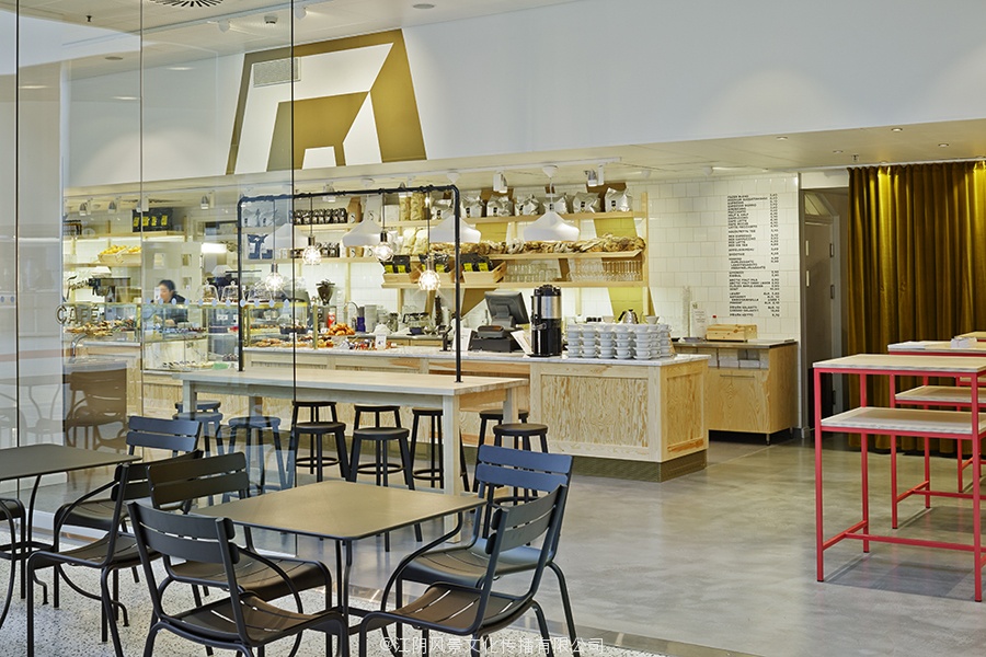
赫尔辛基的咖啡馆 Fazer Café designed by Kokoro & Moi
Established in 1891 by Karl and Berta Fazer and located in Helsinki district of Kluuvikatu, Fazer began life as a French-Russian conditory that has grown to become one of Finland’s largest food companies, working within the bakery, confectionery, and work-place restaurant sectors. Summer 2013 saw the return of Fazer’s café chain to Helsinki with locations in the centre of the city and in the districts of Munkkivuori and Tampere with more to follow.
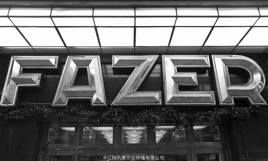
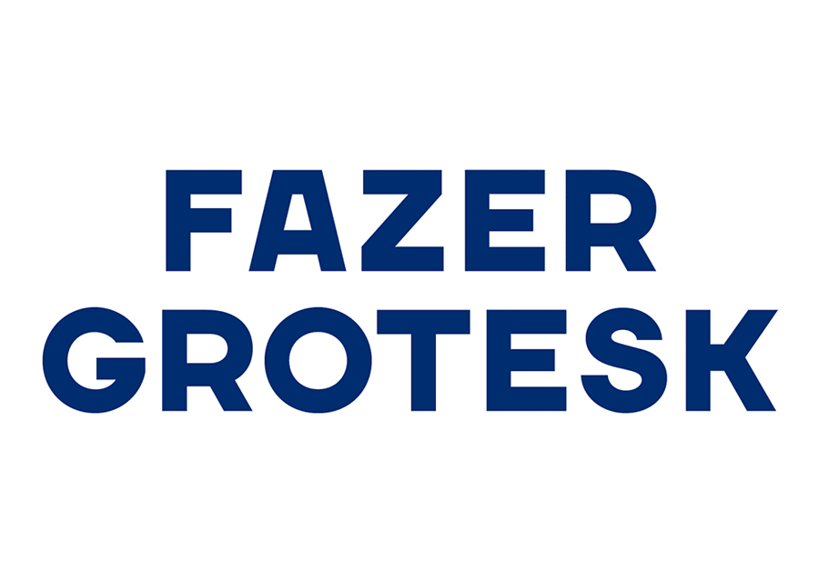
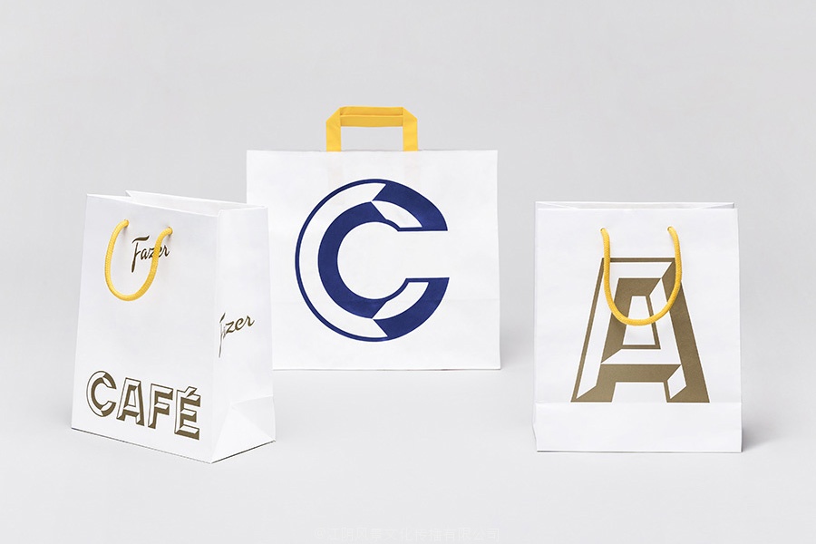
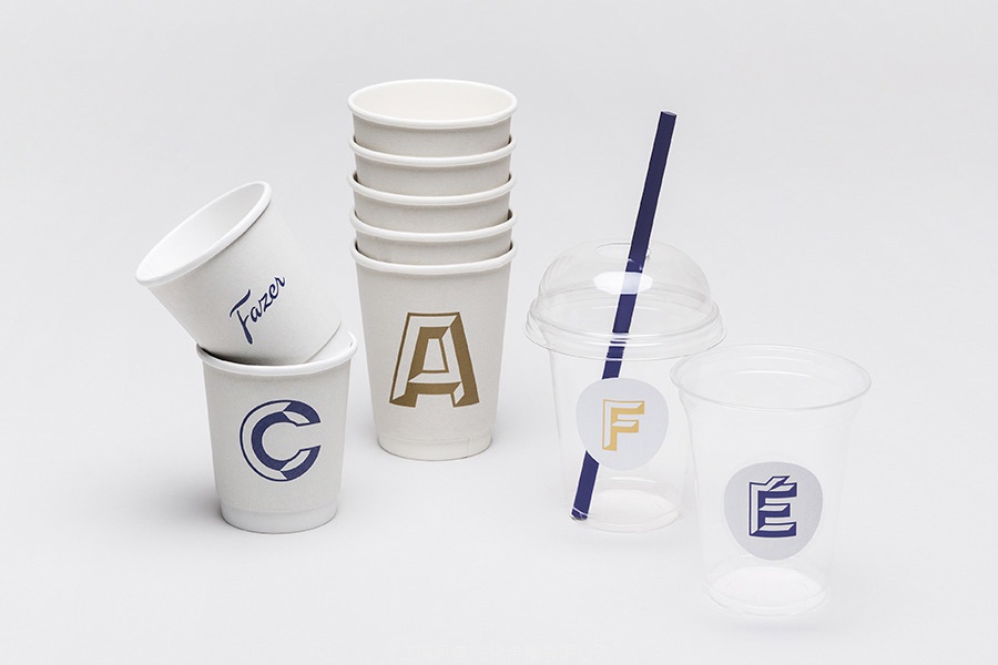
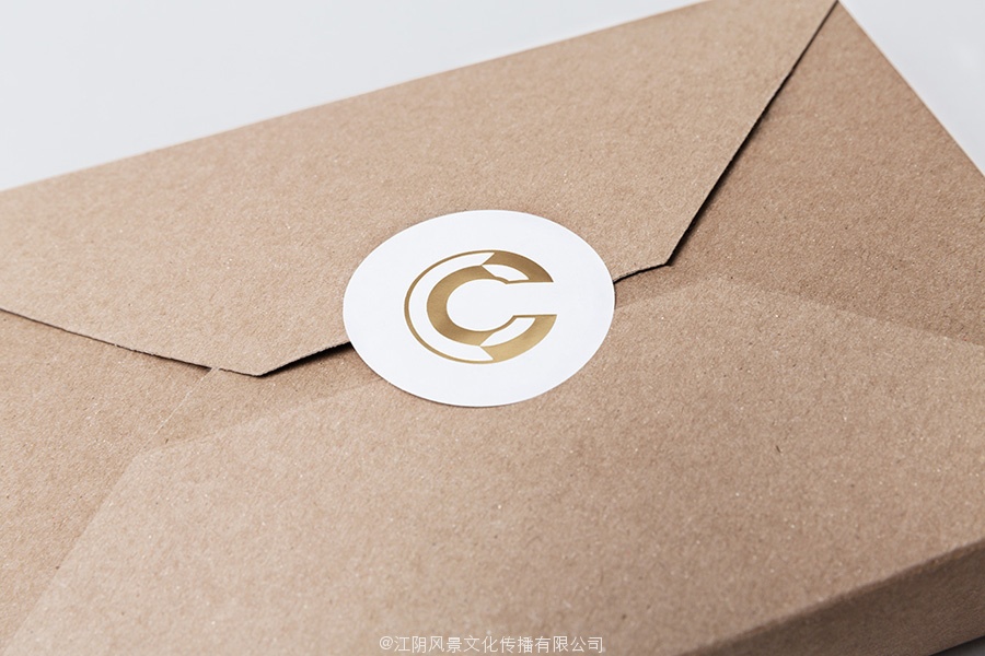
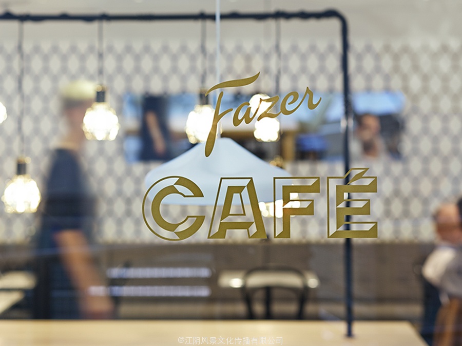
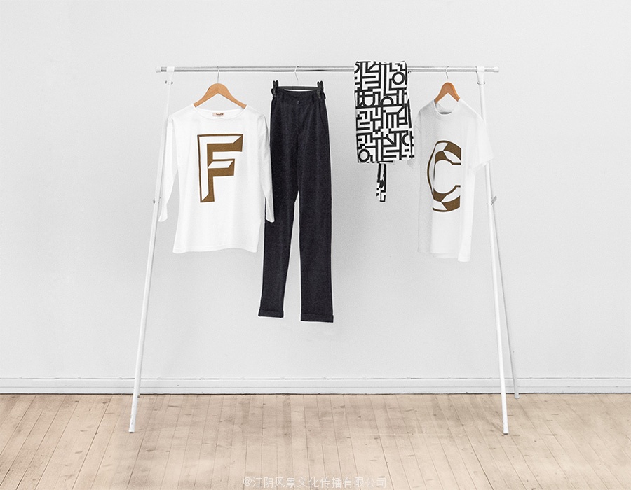
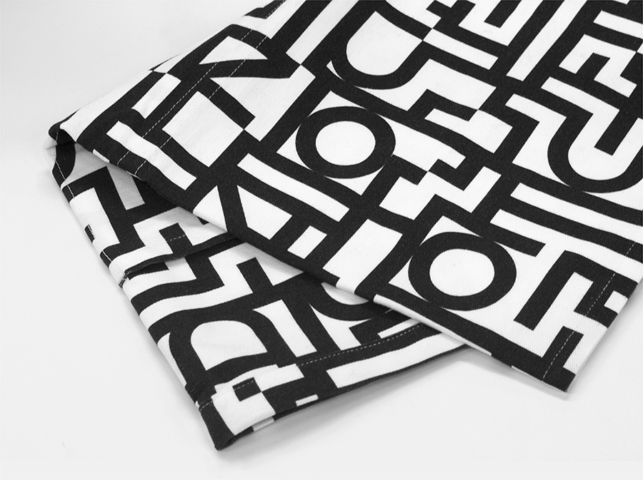
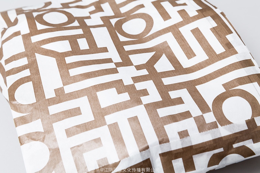
Design agency Kokoro & Moi worked with Fazer to develop a new brand identity for its café chain—which included logo, print, packaging, interior design and a clothing range—based around the bespoke typefaces Fazer Grotesk and Fazer Chisel drawn from signage that hung above Fazer Café’s original Kluuvikatu location.
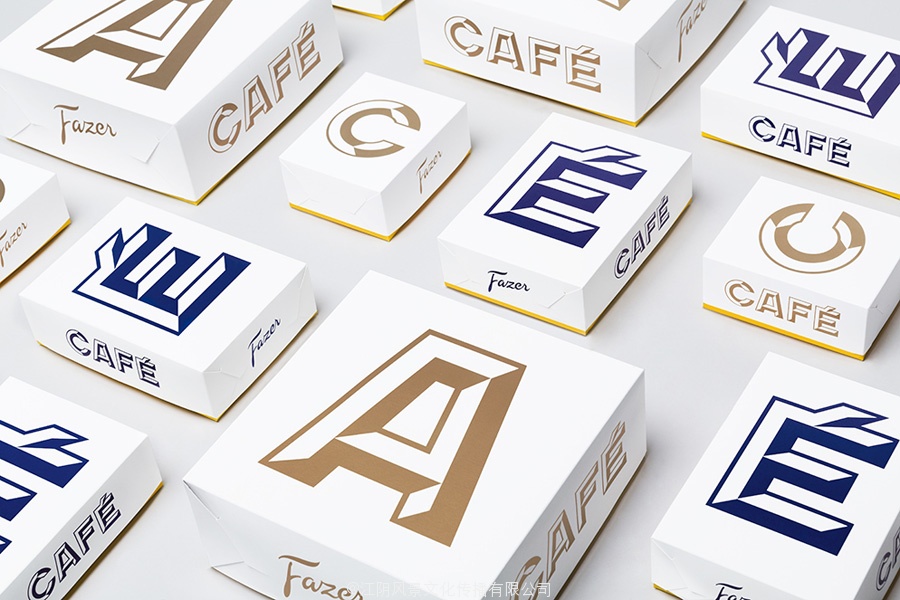
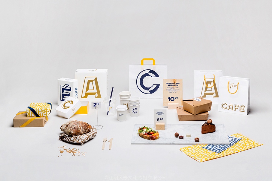
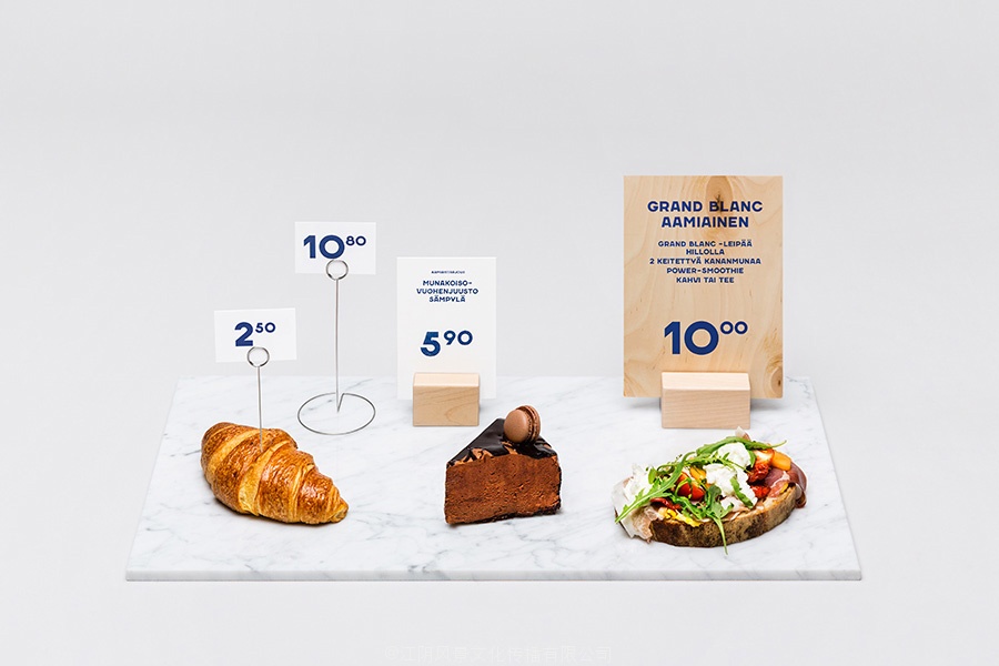
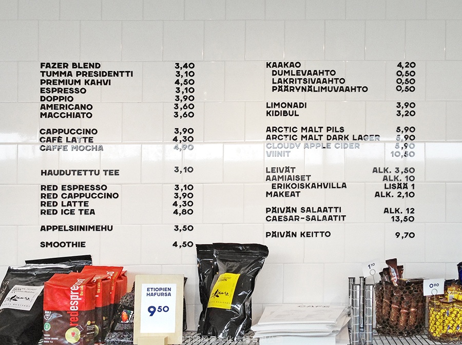
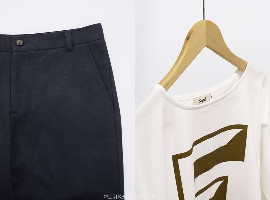
“The typefaces are used comprehensively for all the visual communication and marketing materials. They are utilized everywhere from the logo to the menu boards and price tags and with single characters that take over the packaging materials, clothing and the decor of the walls. Other custom-made graphic elements utilised in the identity, in addition to the typeface, are various patterns that Kokoro & Moi designed to be used in wallpaper, napkins, take-away packaging, and staff accessories among others.”
– Kokoro & Moi
Building a visual identity from a custom typeface has provided Faser Café with a very neat way to unite past and present without undermining the expectations of a modern cafe experience or the company’s significant heritage.
![]()
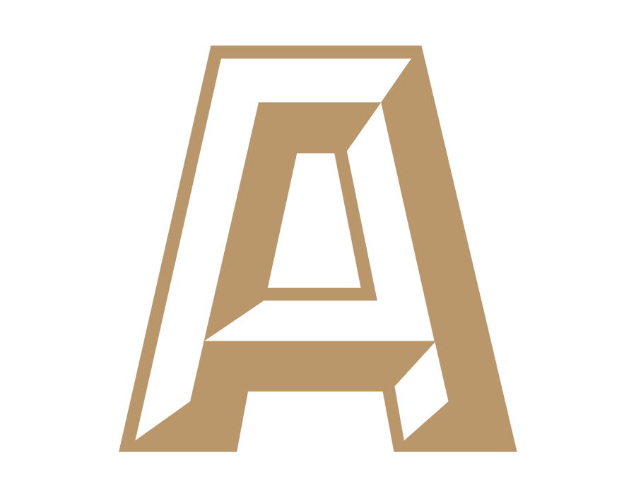
Kokoro & Moi has confidently appropriated the limited brand aesthetic of the café’s past, a simple but interesting logotype and sign, and extended it, creating two uppercase typefaces. The proportions and forms of these have been well handled, mixing familiar and conventional letters with those with a little more distinctive character. Both reproduce well in flat and chiselled forms with a retrospective appreciation that should be perceived as authentic.
The script above ties it to the recognised Fazer brand, itself a well rendered script, that offers a lighter and more accessible contrast to the heavy uppercase forms.
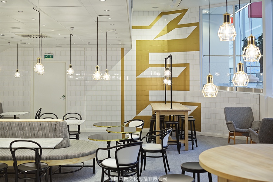
Fazer Grotesk and Fazer Chisel are executed in print with a more recent restraint and eye for space and colour, utilising single inks, a limited colour palette and plenty of unprinted white space, likely and appropriately informed by the extensive use of white tiled and marble surfaces of the interior. Set alongside an over-sized iconic typographic approach—perhaps a reference to the large signage at the café’s original location—the solution neatly binds print communication, packaging, digital and environmental experiences in a simple, cohesive and crafted way.
基于法瑟咖啡由Kokoro & MOI为赫尔辛基设计了大胆的排版方式包装
1891成立由卡尔和贝塔法瑟和位于赫尔辛基区kluuvikatu,法瑟开始生活作为一个法国俄罗斯conditory已经成为芬兰最大的食品公司,在面包店,糖果,和工作场所的餐饮业。2013夏天看到了法瑟的CAFé链返回赫尔辛基地区的中心城市,在munkkivuori和坦佩雷地区更多的后续。
设计公司Kokoro & MOI曾与法瑟建立其CAFé链包括标识,印刷,包装,一个新的品牌标识,室内设计和基于定制字体法瑟Grotesk和法瑟系列服装的标牌挂凿法瑟CAFé的原始kluuvikatu位置之上。
原标识和标牌法瑟咖啡
“字体用综合所有视觉传播和营销材料。他们利用从到处标识的菜单和价格标签和单字符,接管包装材料,服装,墙上的装饰品。其他定制的图形元素应用在身份,除了字体,有各种图案,心与我的设计中使用的壁纸,餐巾,把包装和配件,工作人员等等。”
–Kokoro & Moi
赫尔辛基的咖啡馆的字体很心与MOI设计
从自定义字体构建视觉识别提供了一个非常简洁的方式团结起来,过去和现在在不破坏现代咖啡馆的经验或公司的重要遗产的预期更快的CAFé。
赫尔辛基的咖啡馆的标识设计与MOI Kokoro法瑟
心与我有信心把咖啡馆é过去有限的品牌美学,一个简单而有趣的文字和符号,并将其扩展,创建两个大写字体。这些比例和形式都得到很好的处理,将熟悉的和常规的一点与众不同的特征信。两重现平凿与回顾性升值,应该被视为正宗的形式。
以上关系到确认法瑟品牌剧本,剧本本身很好的呈现,提供了一个更轻,更容易与沉重的大写形式。
基于法瑟咖啡由Kokoro & MOI为赫尔辛基设计了大胆的排版方式包装
法瑟Grotesk和法瑟凿在执行打印空间和色彩更近的约束和眼睛,利用单一的油墨,有限的颜色调色板和印刷大量的白色空间,可能和适当的通知由白色的广泛使用瓷砖和大理石表面的内部。沿着一个超大的标志性的排版方式或许可以引用大标牌在CAFé的原始位置解整齐结合印刷传播,包装,在一个简单的数字和环境经验,凝聚力和制作方法。