Japanese Minori Sake packaging design 日式米诺利清酒包装设计
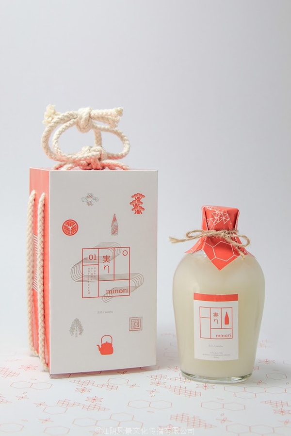
Design student Michael Nguyen has created this Japanese inspired Minori Sake packaging, during his second year at the RMIT University.
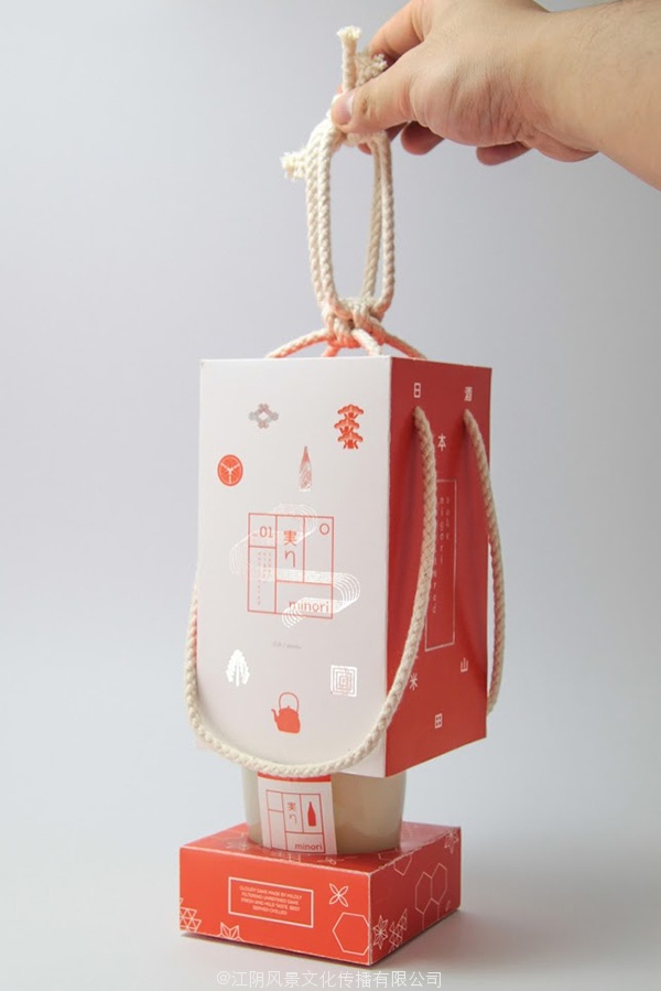
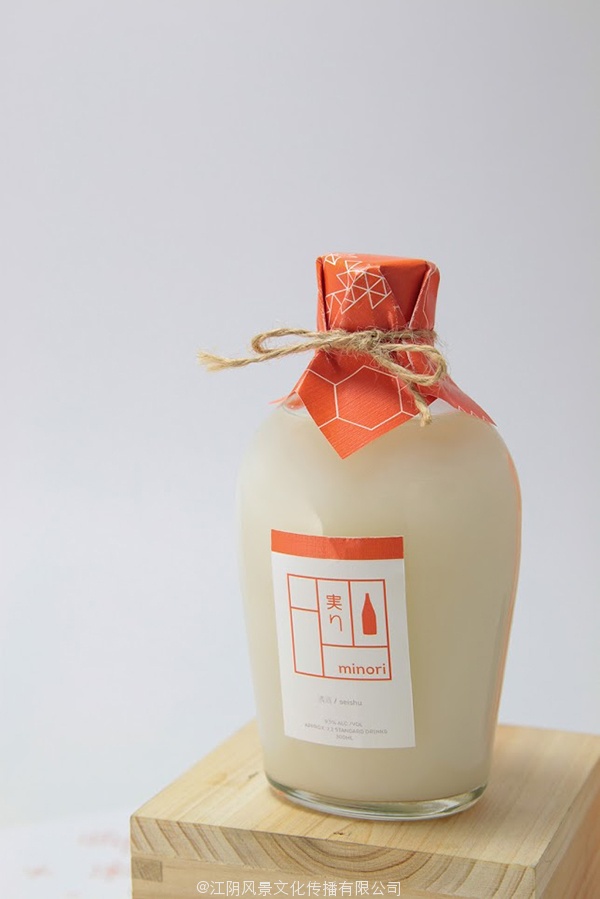
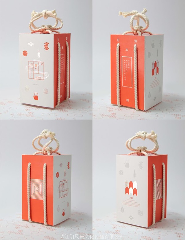
“The brand identity developed is called ‘Minori’ meaning harvest in Japanese. The cloudy sake references rice growers of the Niigata region.”
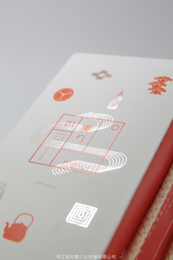
Personally I like the minimalistic design approach on the box, with all the little symbols which refer back to theJapanese culture. Incorporating the rope is also a nice feature and ads to the experience of revealing the sake. I would say that the design on the box works better, than on the bottle.
What do you think about the packaging design?