


Minke designed by Atipo 西班牙小须鲸印刷制作工作室作品
Minke is a Spanish print production studio that favours ‘analogue splendour’ over mass manufacture, providing its clients with a variety of small-scale, mechanical and handcrafted processes.
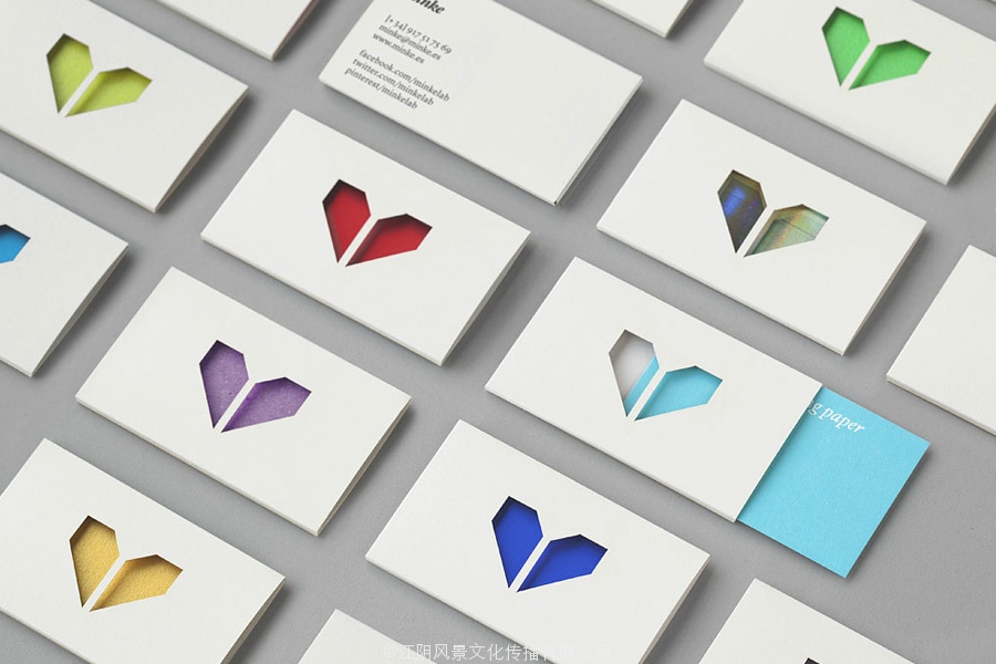
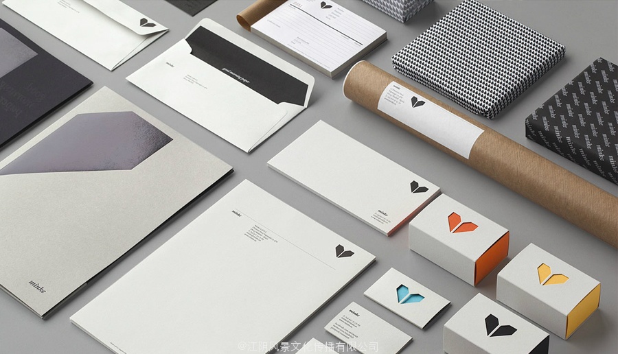
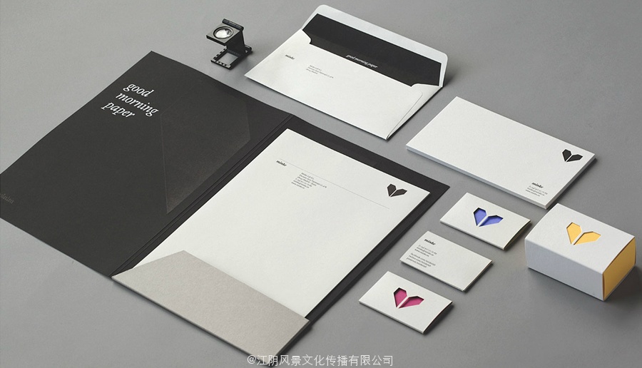
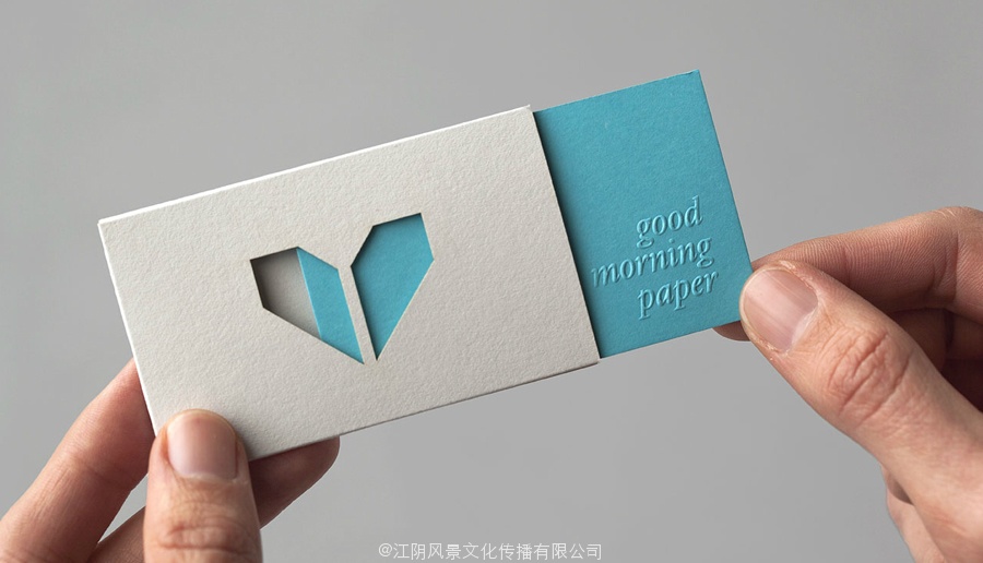
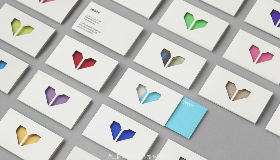
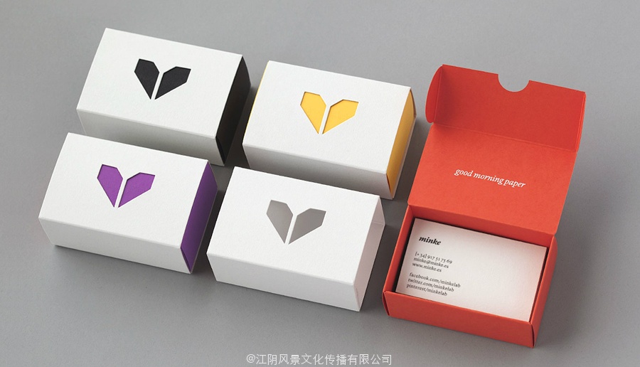
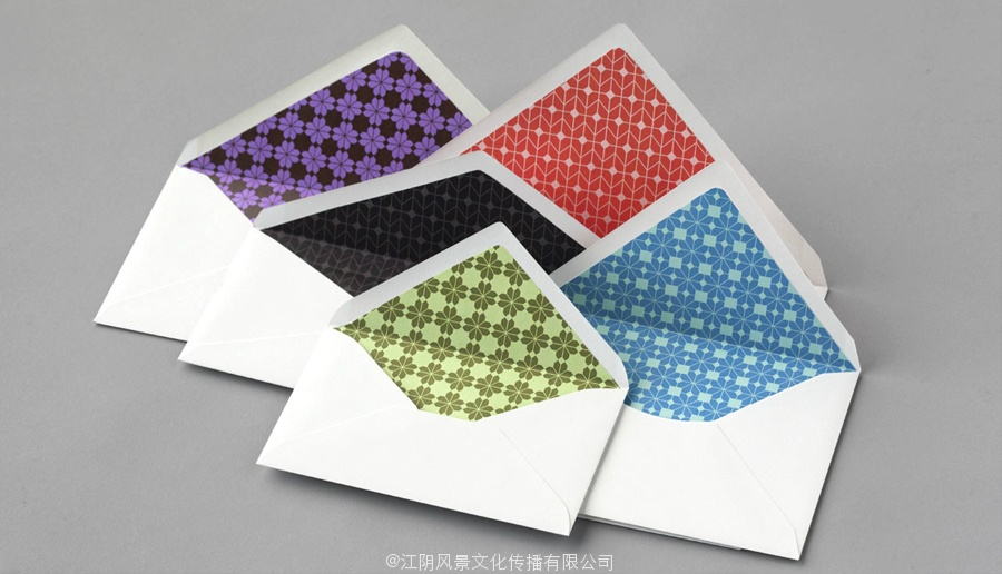
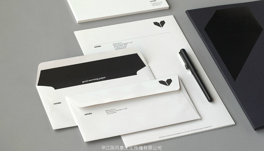
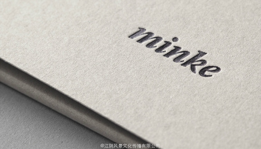
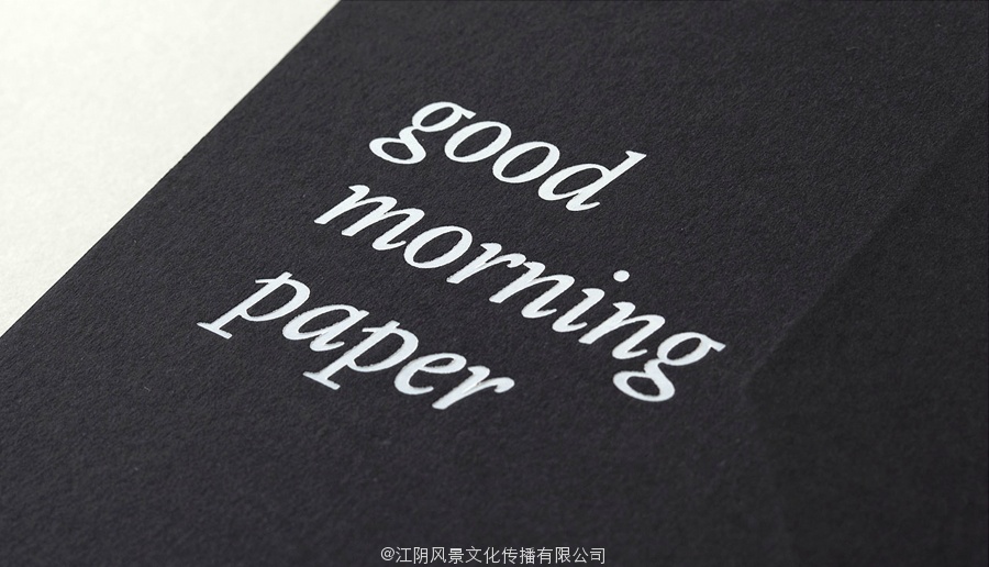
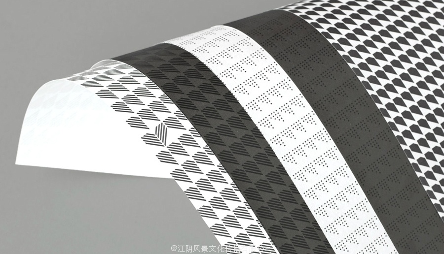
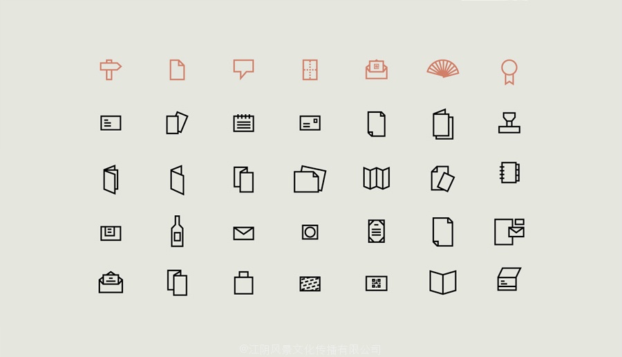
Their visual identity, developed by multidisciplinary design studio Atipo, reflects their services and philosophy through a union of traditional and contemporary material textures, print finishes and die cut detail across the collateral. A sharp juxtaposition of an abstract, geometric mark layered with subtle, slightly reaching brand expressions, the editorial flourish and friendly informality of an all lowercase, italic logo-type, the technological sensibilities of the iconography and the creative detail of the pattern work. Elements united by the restraint and timelessness of a monochromatic colour palette and the more recent energy of bright, spot colour highlights.
The result is an unusual but distinctive union of contrasting shape, typographic style and the communicative effectiveness of physical, tactile, samples that work really well to resolve high quality, uniformity with individual personality and corporate professionalism with creative enthusiasm.
![]()
Follow BP&O:
RSS
Facebook
Twitter
通过对西班牙制作小atipo设计标志和名片
小须鲸是西班牙的一个印刷制作工作室,有利于模拟的光辉在批量生产,为客户提供各种小规模,机械和手工制作的过程。
他们的视觉识别,通过多学科设计工作室atipo发达,反映了他们的服务和理念,通过传统与现代的材料质地的联盟,在并行打印完成和模切细节。一个尖锐的一个抽象的并置,微妙的分层几何标记,稍达到品牌的表达,编辑的繁荣和友好的非正式的全部小写,斜体标识类型的影像学技术,情感和模式创新的细节工作。元素的约束和一个单色的调色板无穷和明亮的最近的能源联合,专色集锦。
结果是一个不寻常的而鲜明的对比形成联盟,字体风格和物理,触觉的交际效果,样品的工作真的很好解决高质量,具有个性和企业专业化创作热情的均匀性。