


Ridley designed by RE 数字建筑服务品牌设计
Ridley is a pioneer of digital architectural services and operates as a central hub from which builders, developers and architects can collaborate. Originally established, and continuing to operate as an architectural documentation specialist, Ridley, from its premises in Australia and the Philippines, has also grown to become a leader in Virtual Design Construction. This is a practice that involves attaching live data to every aspect of a 3D model in order to provide a comprehensive overview of a structure, the process of its construction and significantly reduce the cost of its development.
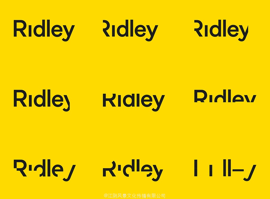
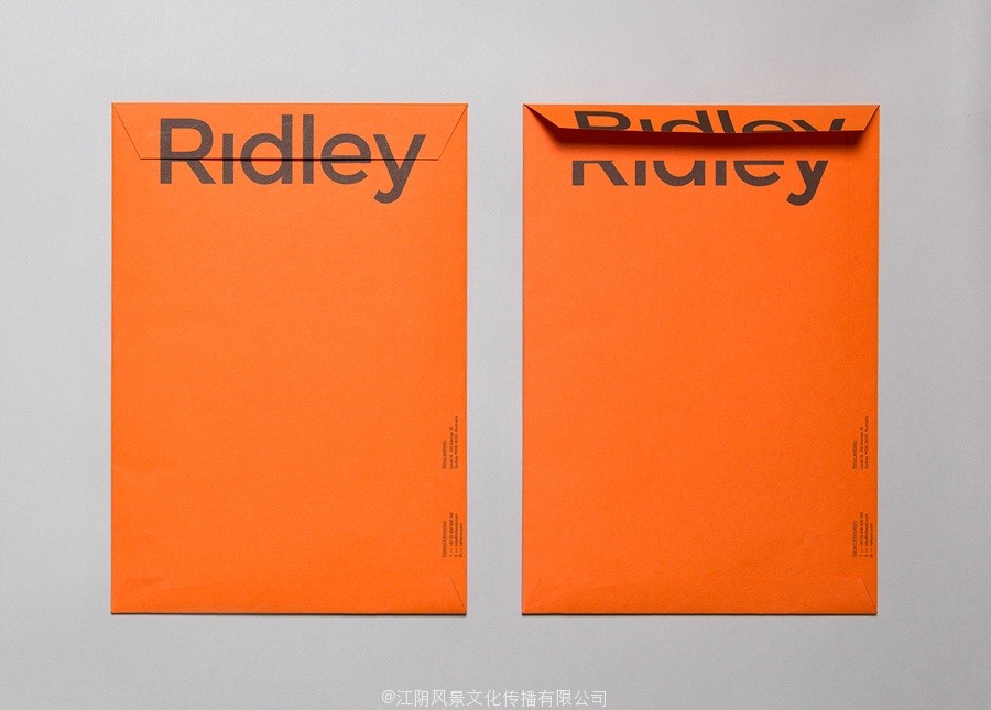
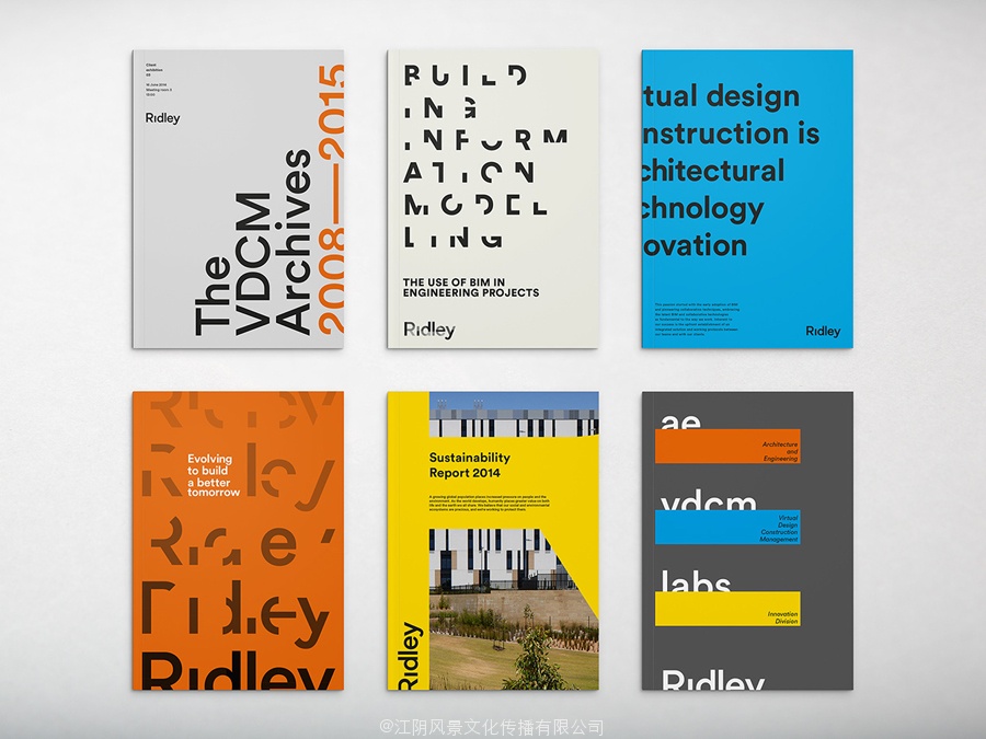
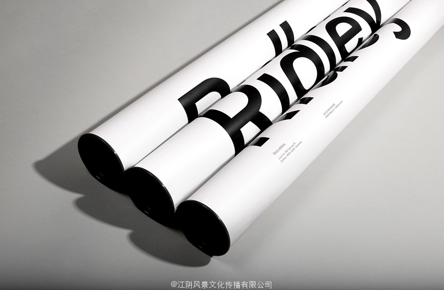
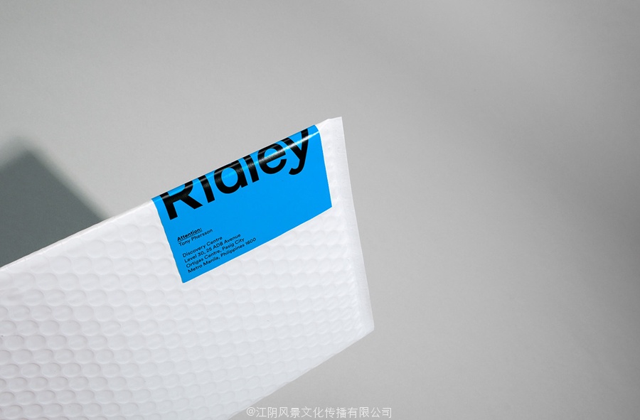
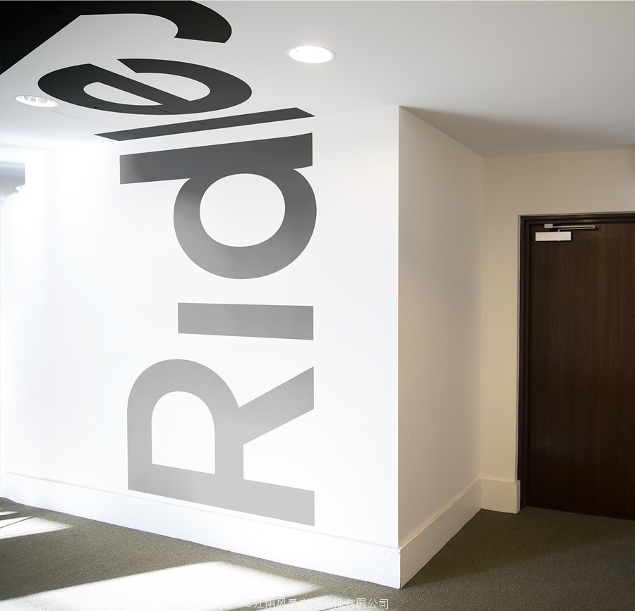
Designed by RE:, Ridley’s new brand identity is based around the concept of seeing the bigger picture through a variety of individual elements, the character, culture and people of its business, and its architectural practices. This is visualised as a variety of cropped and cut sans-serif logotypes, a bright colour palette, human-centric data, and type that runs across multiple planes.
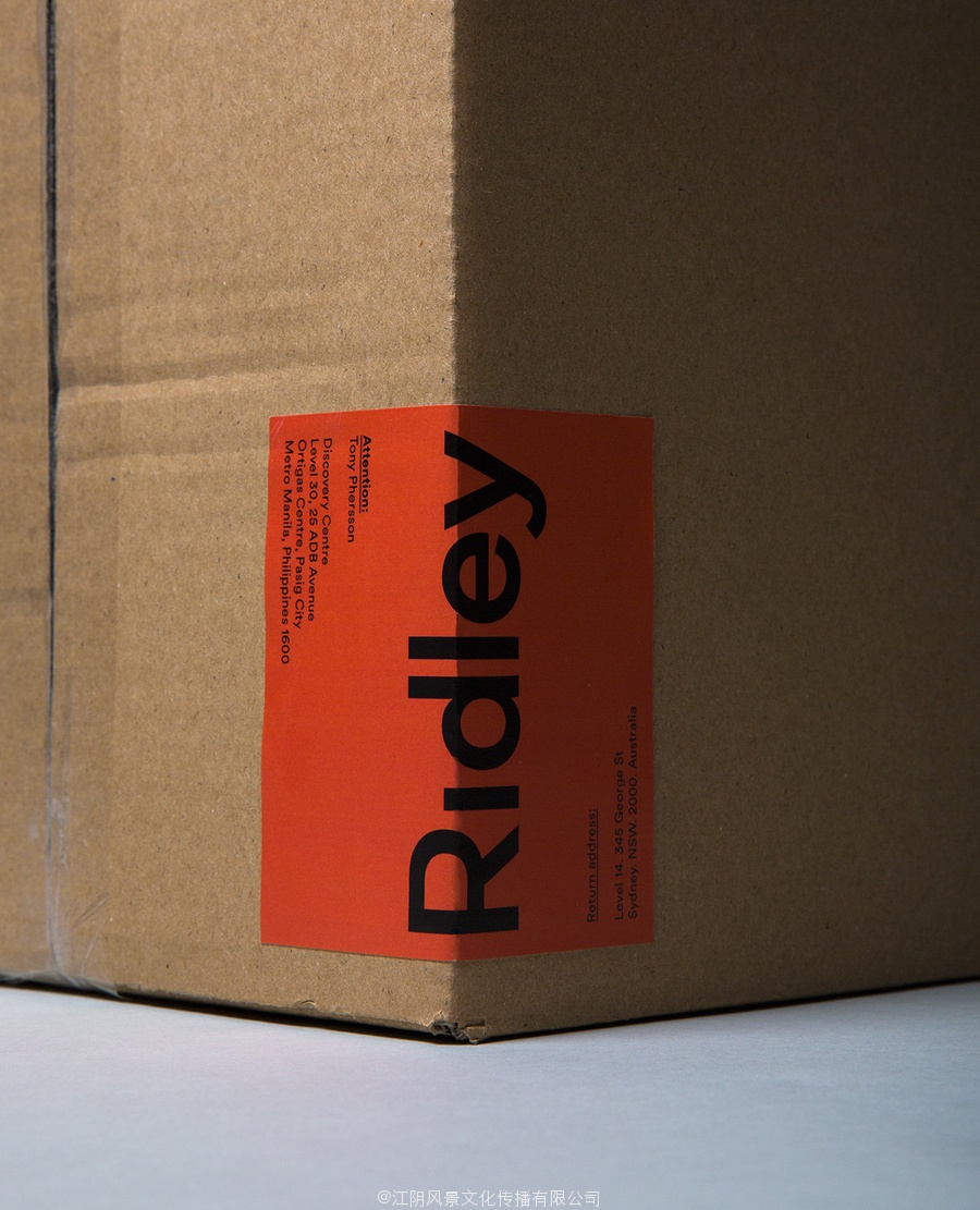
Contrary to current and popular architectural identity conventions such as light and dark concrete grey boards, white inks and foils, blind embosses and grid pattens etc, RE:’s solution is bold and vibrant, combining bright dyed boards and papers, oversized type and a single ink economy. It confidentially blends the accessible, playful and humanistic (culture) with the cold and functional (data). The black ink across yellow board has a strong construction sensibility while other colours appear simply in service of brand character and as a reflection of a positive and energetic brand culture.
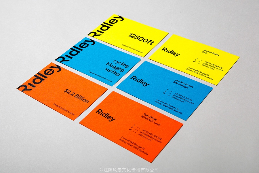
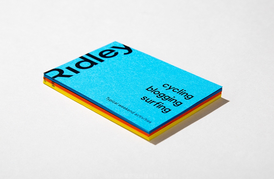
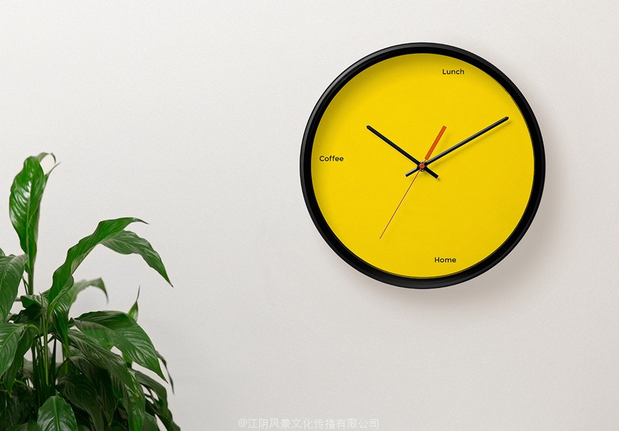
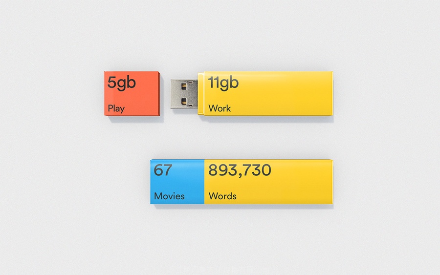
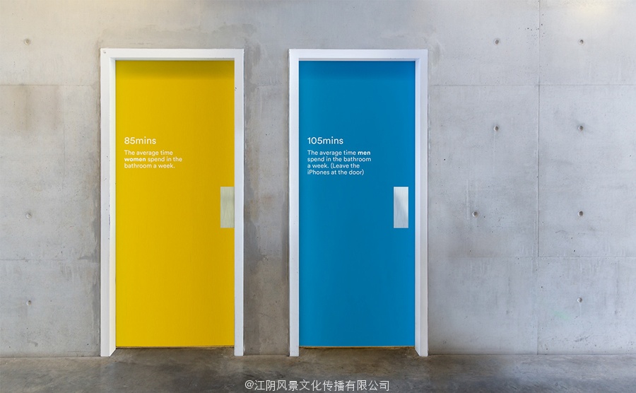
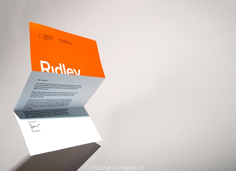
The colour choices make it clear that Ridley is as much about people as it is about the technology that underpins its virtual architectural proposition. This furthered by the introduction of what RE: describe as human-centric data placed throughout the office and across the collateral as a way to help those who engage with the brand better understand the company, projects and the people who work there. This neatly blends corporate data with the activities of its staff across business cards, clock faces, USB sticks and door decals, and is the detail that really gives the project its personality and multidimensional quality. These are clever and like the logotype, have a variety, are well executed and neatly bound by the colour palette.
Design: RE:
Fonts Used: Circular & Montserrat
Opinion: Richard Baird
Follow BP&O:
Feedly
Facebook
Twitter

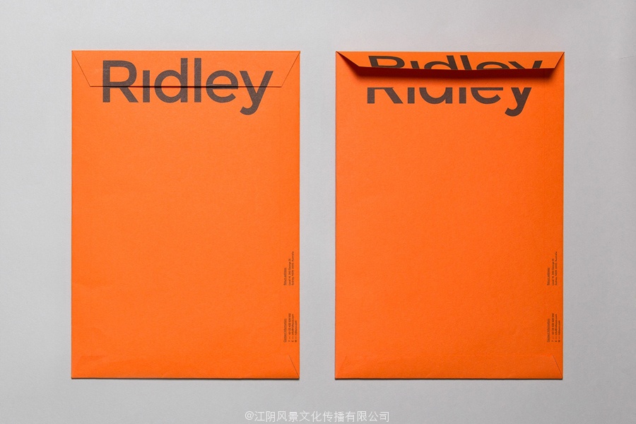
00版的信封再对BPO设计
他是一个数字建筑服务的先驱和作为一个中心枢纽,建筑商,开发商与建筑师合作。最初成立,并继续作为一个建筑文档专家,雷利,从其位于澳大利亚的房屋和菲律宾,也已发展成为一个在虚拟设计施工的领袖。这是一种实践,是将现场数据为一个三维模型的各个方面提供全面的概述的一种结构,其施工工艺和显著降低其开发成本。
设计:,Ridley的新品牌的身份建立在通过各种各样的单个元素,人物看到更大画面的概念,文化和业务的人,其建筑实践。这是可视化的各种裁剪和切sans serif标志,明亮的颜色,以人为中心的数据,和类型,横跨多个平面。
庄稼,削减和Sans-Serif字体和它的应用在壁局部视图,如标签适用于弯曲和包装盒,文具油墨在表面,流失的企业宣传册的边缘和视差的动画,吸引很多品种,从什么是一个简单的和相当中立的角色选择审美影响和交际价值。这是一个熟悉的概念,但不经常做的很好。每一个挑战人们看到不同的个体因素一起作为一个整体,通过调整他们的观点。这种方法有效地起到三维空间,都为墙贴花,并暗示,流失的打印工作面。
01版的标识重新对BPO设计
相反,目前流行的建筑身份公约如光与暗的混凝土灰板,白色油墨箔,盲目压花和网格模式等,重新:溶液是大胆的和充满活力的,明亮的染色结合板和论文,过大的类型和一个单一的墨水经济。这秘密的共混物的可访问的,有趣的和人文(文化)与冷和功能(数据)。在黄色板黑色油墨具有强烈的情感而建设其他颜色的出现只是在品牌个性服务,作为一个积极的和充满活力的品牌文化的反思。
02版的名片,再对BPO设计
03版的名片,再对BPO设计
04版的信封再对BPO设计
颜色的选择很清楚的表明,雷利是关于支持虚拟建筑命题技术的人多。这促进了什么重新介绍:描述为以人为中心的数据放置在办公室和在抵押作为一种方法来帮助那些从事与品牌更好地了解公司,项目和在那里工作的人。这巧妙地融合了企业数据和活动的工作人员在名片,时钟的面孔,USB棒和门上的贴花,并让其个性和多维的质量项目的细节。这些都是聪明,喜欢文字,有各种各样,良好的执行和颜色调色板装订整齐。