


New Logo and Identity for CTIL VI设计再次说明应用活则标志活
new
First announced in 2012 as a partnership in the UK between mobile providers Vodafone and Telefónica (which runs O2) to develop and share a cellular network to deliver 4G connectivity and compete with the T-Mobile and Orange partnership now known as Everything Everywhere, Cornerstone Telecommunications Infrastructure (CTIL) is the company that will serve as the conduit for this to happen while the two companies maintain their separate, competing consumer brands. There is no website yet for CTIL but its identity has been designed by London-based SomeOne.
There are many benefits to the layers of the new business, and the partnerships between Vodafone & Telefónica—it was these layers that inspired the new strategic visual brand identity. […] With a Brand World based on layers — each time it’s seen, the visual work can be configured differently, enabling people to discover a new layer at each interaction.
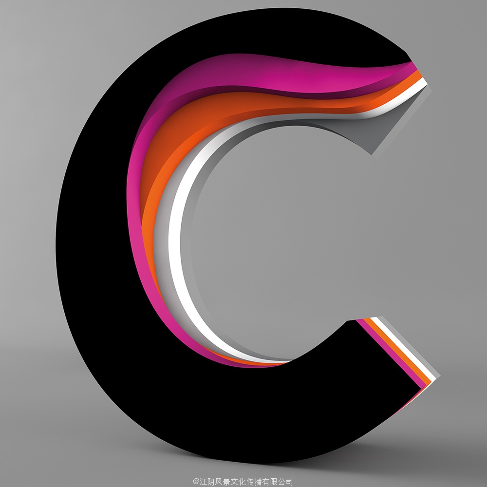
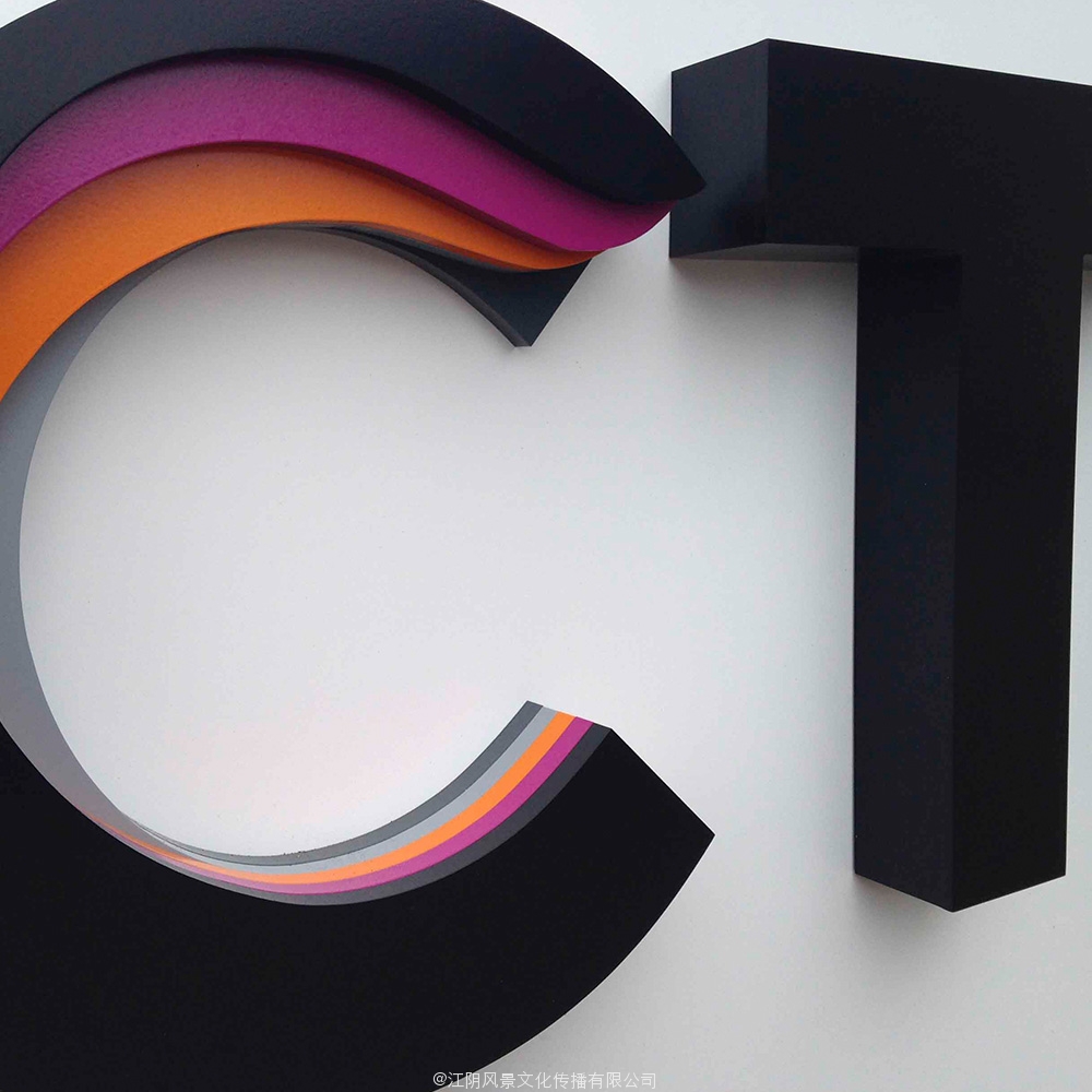
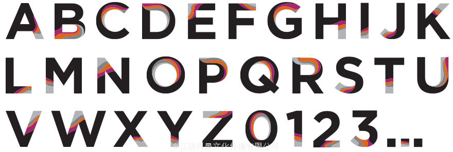
This is almost too cool for a background company; I could easily see this as a mobile operator brand of its own, rather than for the unbelievably boring sounding “Cornerstone Telecommunications Infrastructure”. Peeling away at the “C” in the logo and the rest of the letters in the custom alphabet turns the otherwise expected Gotham into an engaging, surprising sans serif. While I’m the first to argue against 3D approaches, the logo highly benefits from the exposed view that reveals the layers — and in the identity below, when the layering effect is used on the different materials, having that slight bit of shading/gradient in the layers really helps add dimension.

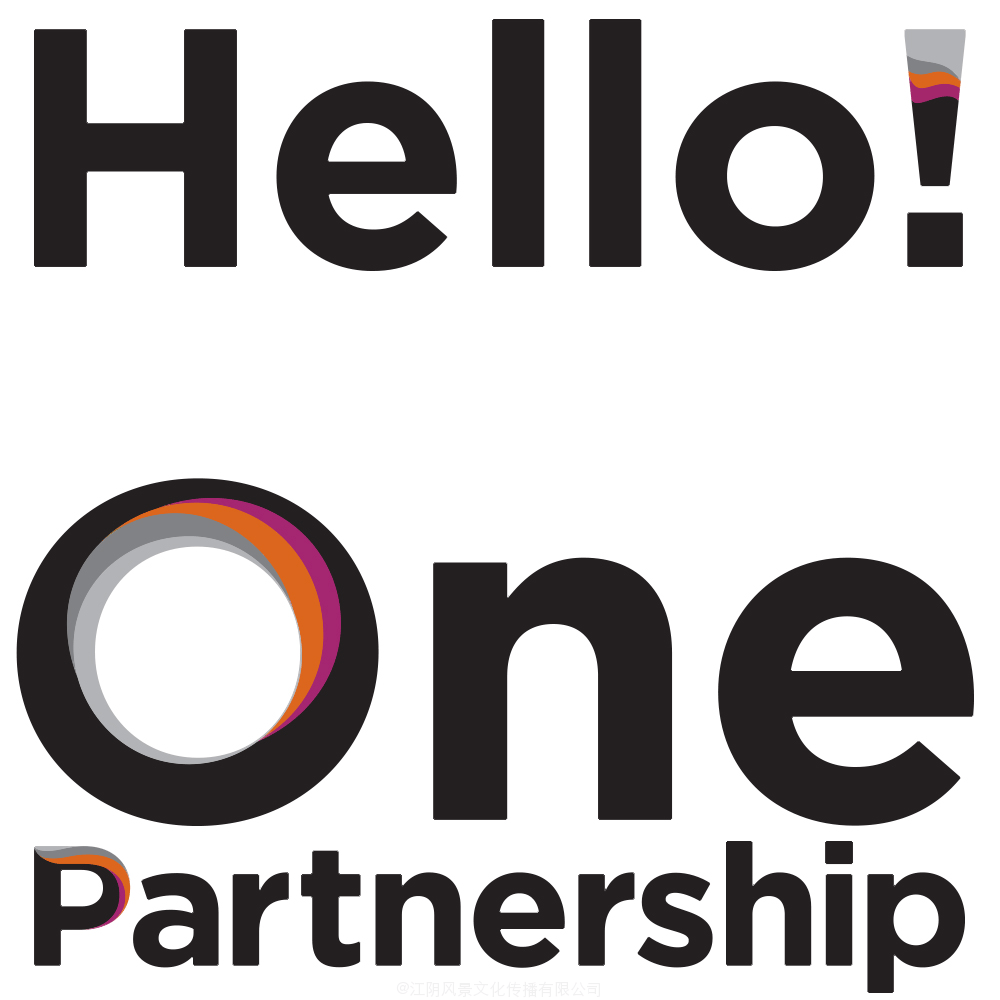
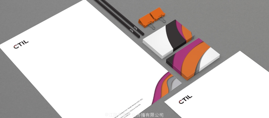
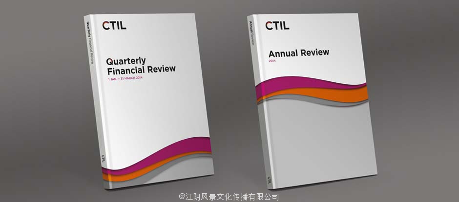
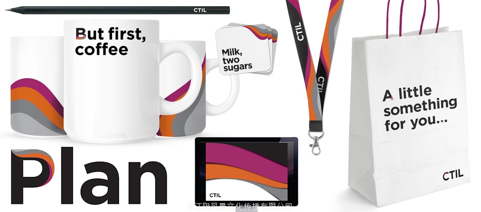
In application, the layers remind me of Milton Glaser’s “Dylan” poster but gone corporate. This is both a good and a bad thing. There is just enough flow in those applications to keep the materials lively but the abundant white space and Gotham typography ground it in the seriousness the name of the company calls for. Overall, the layering effect is a winning concept but the applications could have been developed with a bit more sophistication.
几乎是太酷了;我可以很容易地看到这是它自己的移动电话运营商品牌,而不是令人难以置信的无聊的冠冕堂皇的“基石的电信基础设施”。剥离在“C”标志和自定义的字母表的字母都变成其他预期高谭市到引人入胜,令人惊讶的衬线。当我反对的3D方法第一,标志高度受益于暴露的观点,揭示了层和下面的身份,当分层效果上使用不同的材料,具有在层/梯度着色点真的有助于增加尺寸。