


Chinese Restaurant brand identity 和兴饭店视觉设计
![]()


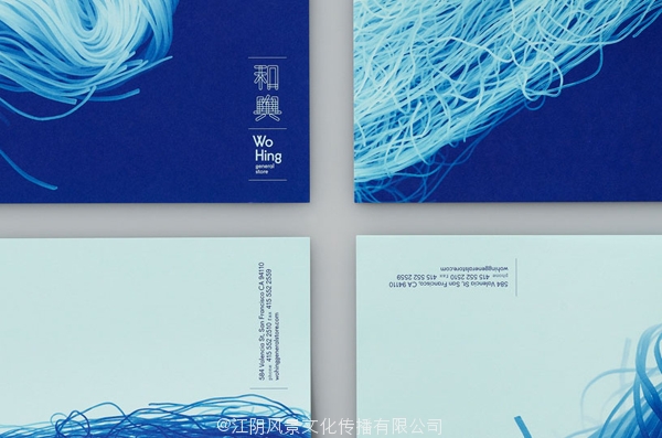
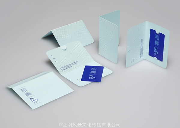

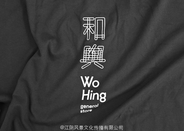
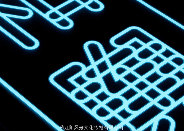


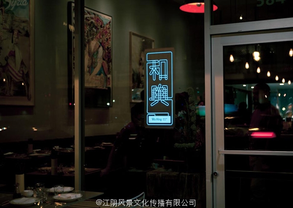
From all the brand identities of Chinese Restaurants I’ve seeing thoughout the years the Wo Hing restaurant identity is one which really stands out. The inspiration for the restaurant logo emerged from chinese street food stales which often feature tubular neon signs. The logo also reminds me of the Japanese Torotor restaurant identity.
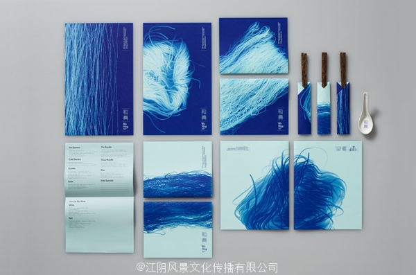
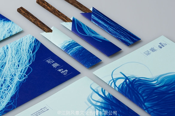
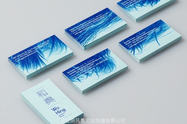
In addition to the logo San Francisco visual communication studio Manual created a strong visual language using noodles. Manual used a scanner to experiment with raw and cooked noodles to create a number of flowing, abstract images.
所有的中国餐馆,我看到thoughout多年馨餐厅的身份,这是一个真正脱颖而出的品牌标识。为餐厅标志从中国食品街出现灵感往往具有管状霓虹灯。这个标志也让我想起了日本torotor餐厅身份。
除了标志三藩视觉传达工作室手动创建了一个强烈的视觉语言使用的面条。手册中使用的扫描仪,生熟面条实验创建一批流动,抽象的图像。