


Friday Likes 70 不错的色彩搭配
A range of quirky, stark, and sophisticated work (plus a lot of ampersands) kick off 2014’s Friday Likes with work from Seattle, San Diego, and London.
一系列古怪的,赤裸裸的,复杂的工作(再加上大量的符号)开球2014星期五喜欢与来自西雅图,圣迭戈,伦敦。
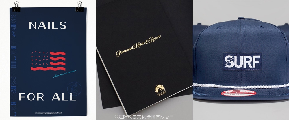
Nails for America by Clara Mulligan
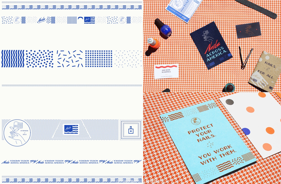 Today we start with a quirky, acquired-taste identity by Seattle, WA-based Clara Mulligan for Nails for America, a project by Wassaic, NY-based Breanne Trammell who transformed a 1968 Shasta Compact trailer into a mobile salon to do nails and “to create an intimate platform to exchange ideas and conversation”. The identity has many moving parts, including nail clippings — eeeew but also yaaaay — multiple patterns, an electric script font, an art deco font, and a whole lot of moxie. My least favorite aspect of the identity is the logo itself of the hand with the flag, but everything else has a really fun vibe mixed in with a bit of sleazy 1980s Patrick Nagel aesthetic. Very appealing and unappealing all at the same time, in the best of ways. See full project.
今天我们开始一个古怪的味道,西雅图获得认同,是基于克拉拉Mulligan钉子的美国,由瓦塞克项目,纽约布里安娜特拉梅尔谁改变1968沙斯塔紧凑的拖车到一个移动的美容院做指甲和“创造交流和对话”亲密的平台。认同有许多移动部件,包括指甲剪——eeeew也yaaaay多模式,电动脚本字体,艺术装饰风格的字体,和很多的勇气。我最不喜欢的方面的身份标志本身的手和标志,但一切真是一个有趣的气氛中混有点肮脏的80年代帕特里克Nagel审美。非常有吸引力和没有吸引力,所有在同一时间,在最好的方式。看到完整的项目。
Paramount Hotels & Resorts by & Smith
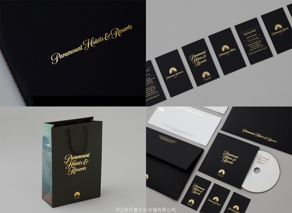 From movies to 1%-er hotels and resorts: Paramount is developing a number of really high-end hotels and resortsacross the world and the identity by London-based & Smith clearly signals this is no Hilton. Based on the movie studio’s script wordmark the Paramount Hotels & Resorts’ own logo, printed in gold against pitch-black backgrounds, exudes all the sophistication and richness your wallet can handle. The moody photography sets the tone for a luxurious experience and while most of us may scoff at the opulence of the project, the identity is very much on target and lusciously executed. See full project.
从电影到1%二酒店和度假村:最重要的是开发一些真正高端酒店和resortsacross世界和身份由总部设在伦敦的史密斯明确信号,这不是希尔顿酒店。基于电影的剧本wordmark派拉蒙酒店及度假村的标志,在漆黑的背景在金印,无不散发着成熟和丰富你的钱包可以处理。穆迪摄影的奢华体验,而我们大多数人可能会嘲笑这个项目的富裕的基调,身份是非常多的目标和甘美的执行。看到完整的项目。
Transworld Surf by Wedge & Lever
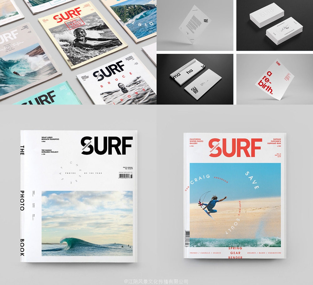 It’s a bit unusual to include a magazine as an identity project on Friday Likes, but there is a fantastic combination here of consistency and flexibility in the covers and typographic treatments that apply just as well to any identity project. Designed between 2011 and 2013 by San Diego, CA-based Wedge & Lever, Transworld Surf (now only a digital publication) looks like the bastard baby of Josef Müller-Brockmann and David Carson with a mix of inventive typography and no non-sense minimalism. It’s the now popular hipster design aesthetic done right and for the appropriate audience and context. See full project.
包括星期五的身份项目喜欢杂志上有点不一样,但有一个奇妙的结合在这里在封面和版式的治疗方法,适用于任何身份项目的一致性和灵活性。在2011和2013的圣迭戈设计的,基于CA的楔和杠杆,该冲浪(现在只有一个数字出版)看起来像一个创造性的排版和无意义的极简主义的üJosef M ller Brockmann字体和戴维卡森混蛋宝贝。这是现在流行的时髦的设计美学做正确和适当的观众和背景。看到完整的项目。